This whole thing came about because I mentioned a few months back that it was a personal dream of mine to have Belgian-born “lord of the logos” Christophe Szpajdel do a logo for this site. I’ve dug Szpajdel‘s work since I first saw it editing a feature about him in Metal Maniacs, in what I like to think of now as “the before time.” Well, Kiffin Rogers of Napalm Christ/Rwake was kind enough to put me in touch and Szpajdel, instead of pointing to the nearest cliff and asking me in so many words to leap from it, was on board with designing a logo for The Obelisk. This was most certainly exciting news.
Now, I like the Skillit header currently on this site. Fucking love it, in fact, and I plan on keeping it in use along with the new design. In its every detail, it excellently encapsulates a lot of the vibe that I enjoy most about this site. However, to ask Skillit‘s work to mesh with Szpajdel — who’s more known for his associations on the extreme end of black and death metal than anything resembling desert rock — would be unfair to both artists. Adam Burke (interview here), however, seemed like a perfect fit, with his watercolor style, deep tones and fantasy influence.
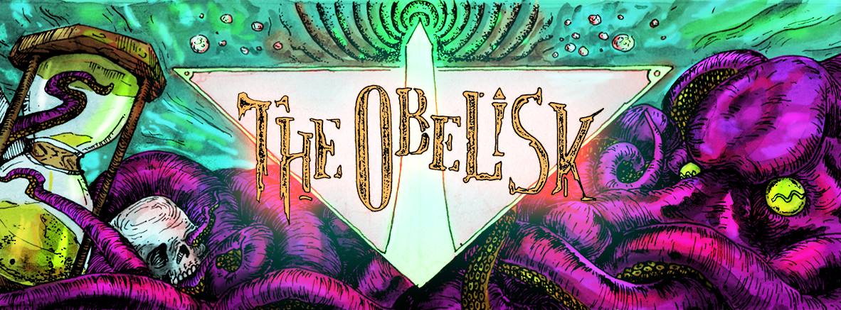
A phrase I actually used in my email to Burke talking about what I had in mind for the header piece: “A land-octopus off to one side or the other’s always welcome by me.” Rules to live by, people.
Obviously, when the finished product came in, I was flabbergasted. Here’s a look at the details of both the header art and the logo. Click any to enlarge.
Header Art by Adam Burke
You ever have a picture in your mind of what you want and then what you wind up with not only is that thing, but is that thing better? Yeah, that’s kind of how it went with this one. The land-octopus, the sunscape, the crags on the left side, Burke absolutely nailed it. I damn near wept when I opened the file.
Logo by Christophe Szpajdel
This is the original hand-drawn version of the logo. You can see the marker marks and the lighter spaces where his stroke lifted. So fucking cool. If you do or don’t know Szpajdel‘s work, he’s an absolute master. It was an honor to email with him, let alone actually have him send this as an attachment.
I, on the other hand, am not at all a master when it comes to graphic design, and though I tried for an embarrassingly long time, I couldn’t get the logo either completely black or onto a transparent background. Outside help was enlisted, and this emerged as the finished version (turned white for posting here — also maybe for t-shirts):
When I put them together — that I could do — this is how it wound up:
The Finished Product
I don’t think I could be any happier with how it all came out in the end of I tried. Huge thanks to Christophe Szpajdel and Adam Burke for their attention and hard work. Please check out their sites/portfolios and support underground art by giving them money and telling other people how much ass they kick.
Posted in Visual Evidence on December 31st, 2013 by JJ Koczan
First thing, let me give the immediate and familiar disclaimer: This isn’t everything. If I wanted to call this list “The ONLY 10 Album Covers that Kicked Ass in 2013,” I would. I didn’t do that, because there were way more than 10 covers that resonated when I saw them this year. The idea here is just to check out a few artists’ work that really stuck out as memorable throughout the year and really fit with the music it was complementing and representing.
As always, you can click the images below to enlarge them for a more detailed look.
The list runs alphabetically by band. Thanks in advance for reading:
Like Nick Keller‘s cover for New Zealand heavy plunderers Beastwars‘ 2011 self-titled debut (review here), the darker, moodier oil and canvas piece that became the front of Blood Becomes Fire(review here) created a sense of something truly massive and otherworldly. A huge skull with sci-fi themes and barren landscape brought to it foreboding memento mori that seemed to suggest even land can die. It was an excellent match for the brooding tension in the album itself.
The level of detail in Arrache-toi un oeil‘s cover for Blaak Heat Shujaa‘s full-length Tee Pee Records debut, The Edge of an Era(review here), would probably be enough for it to make this list anyway, but the Belgium-based art duo seemed thematically to bring out the swirl, chaos and underlying order within the Los Angeles trio’s desert psychedelia. Blue was for the vinyl edition, brown for the CD digipak (both were revealed here), but in either format it was a reminder of how much visual art can add to a musical medium.
Black Pyramid, Adversarial
Cover by Eli Wood.
I look at the Eli Wood cover for Black Pyramid‘s Adversarial(review here) as representing the task before the band in putting out their third LP. Released by Hydro-Phonic, the album found Black Pyramid coming head to head with both their audience’s expectations of what they were in their original lineup and their own will to move past that and become something else. If there was a second panel to the cover, it would show the arrow-shot warrior standing next to the severed head of the demon he slayed. Easily one of my favorite covers of the year. The scale of it begged for a larger format even than vinyl could provide.
It was such a weird record, with the interludes and the bizarre twists, that Samantha Allen‘s cover piece for Ice Dragon‘s Born a Heavy Morning (review here) almost couldn’t help but encompass it. The direct, but slightly off-center stare of the owl immediately catches the eye, but we see the titular morning sunshine as well, the human hand with distinct palm lines, illuminati eye and other symbols — are the planets? Bubbles? I don’t know, but since Born a Heavy Morningwas such an engrossing listening experience, to have the visual side follow suit made it all the richer.
Kings Destroy, A Time of Hunting
Cover by Aidrian O’Connor.
In Magyar mythology, the bird-god Turul is perched atop the tree of life and is a symbol of power. With its theme in geometry, Aidrian O’Connor‘s cover piece for Kings Destroy‘s ATime of Hunting — which was originally titled Turul— gave a glimpse at some of that strength, positioning the viewer as prey below a creature and sky that seem almost impossible to parse. I felt the same way the first time I put on the finished version of the Brooklyn outfit’s second offering, unspeakably complex and brazenly genre-defiant as it was.
Alexander von Wieding deserves multiple mentions for his 2013 covers for Black Thai and Small Stone labelmates Supermachine, but he always seems to save the best for his own project, Larman Clamor. The one-man-band’s third LP, Alligator Heart(review here), was a stomper for sure, but in his visual art for it, von Wieding brilliantly encapsulated the terrestrial elements (the human and reptile) as well as the unknowable spheres (rippling water, sun-baked sky) that the songs portrayed in their swampadelic blues fashion. It was one to stare at.
Similar I guess to the Beastwars cover in its looming feel and to the Black Pyramid for its scale, John Sumrow‘s art for Monster Magnet‘s Last Patrol(review here) mirrored the space-rocking stylistic turn the legendary New Jersey band made in their sound, taking their iconic Bullgod mascot and giving it a cosmic presence, put to scale with the rocketship on the right side. It stares out mean from the swirl and regards the ship with no less a watchful eye than Dave Wyndorf‘s lyrics seem to have on society as a whole.
There’s a mania to Orion Landau’s cover for Red Fang‘s third album, Whales and Leeches, and while the songs that comprise the record are more clearly structured, the collage itself, the face it makes when viewed from a distance, and the (from what I’m told is brilliant) cut-out work in the physical pressing of the album, all conspired to make one of 2013’s most striking visuals. As the in-house artist for Relapse, Landau is no stranger to landmark pieces, but this was a different level of accomplishment entirely.
Fuck. Look at this fucking thing! Galaxy spiral, vagina-dentata, creepy multi-pupil eyes and a background that seems to push the eye to the middle with no hope of escape even as blues and oranges collide. Wow. Sandrider bassist JesseRoberts‘(see also The Ruby Doe) artwork for Godhead (review here) is the only cover on this list done by a member of the band in question, and though I’m sure there are many awesome examples out there, I don’t know if any can top this kind of nightmarishness. Unreal. The sheer imagination of it.
When I put together a similar list last year, it had Summoner‘s first album under the moniker, Phoenix, on it, and with their second, they went more melodic, more progressive, and showed that heaviness was about atmosphere as much as tone, and that it was a thing to be moved around rather than leaned on. The Alyssa Maucere art, dark but deceptively colorful, rested comfortably alongside the songs, with a deeply personal feel and unflinchingly forward gaze, somewhat understated on the black background, but justifying the portrayal of depth.
—
As I said above, there’s a lot of stuff I could’ve easily included on this list, from The Flying Eyes to Sasquatch to Black Thai to Lumbar, Samsara Blues Experiment, Goatess, At Devil Dirt and others. Hopefully though, this gives a sampling of some people who are doing cool work in an under-represented aspect of underground creativity.
If I left anything out or there was a cover that really stuck with you that I didn’t mention, I’d love to hear about it in the comments.
Posted in Visual Evidence on December 18th, 2013 by JJ Koczan
Both of these are pretty badass and I didn’t figure anyone would complain, so I thought I’d put up the posters for Desertfest next year. Both London and Berlin have come out in the last couple days — you’d almost think it wasn’t a coincidence! — and though each has its own personality like the fests themselves, I think looking at either you know you’re getting a heavy show. Maybe I’m biased.
Malleus handled the London poster, and Ammo, from Belgium, the Berlin one. For Malleus, these are pretty regular themes — their affection for redheads goes way back and here brings to mind some of the exploits of Fanny Jo Stingray, may she rest in piece — and with Ammo’s the pencil grays and insane level of detail bring to mind a black and white take on Earth‘s The Bees Made Honey in the Lion’s Skull, though obviously the color/lack thereof makes a huge difference.
Check them out and see what you think:
Desertfest London 2014 Poster by Malleus
We are pleased to be able to unveil Desertfest 2014’s awesome limited addition screen print poster, created by the equally awesome Malleus. Malleus is a poster art trio featuring Poia and Urlo of UFOMAMMUT and we just couldn’t help get them involved again. The prints will be available next week to pre order at £20 and of course will be available at the festival.
We are also excited to be announcing the Human Disease/When When Planets Collide stage on Thursday. Expect a heavy underworld line up…
We are thrilled to unveil our official poster for DESERTFEST BERLIN 2014, made by the Brussels-based guy AMMO!! We really dig it, and we hope you too!
You will discover more about AMMO through an interview that will be published soon, but meanwhile, you can check his past work onhttp://ammoamo.blogspot.fr/!
Posted in Visual Evidence on November 30th, 2013 by JJ Koczan
If the going theme was supposed to be evisceration, then at least BongCauldron‘s brand of sludge stands up to it. The Leeds-based three-piece will make their self-titled debut with an EP on Superhot Records that’s expected to be out on Jan. 13, 2014, and today I have the pleasure of hosting the debut of the art for the release, which appears with a gleefully degenerate sensibility courtesy of artist Smyles (website here).
BongCauldron recently supported Windhand and Pilgrim in Manchester as those two acts made their way through the UK, and on Jan. 24, they’re slated to appear with Wolfshead and Desert Storm at their first show in London, playing The Black Heart in Camden Town.
More to come on these guys, but click on either image below to enlarge it for a hi res view in the meantime, and get some background on the band courtesy of the PR wire below:
BongCauldron, BongCauldron EP info
Since their formation in 2011, BongCauldron has developed a reputation on the local Leeds metal scene as a sleeping colossus. A beast that only ever truly awakens from its slumber when called upon to thrash out a cacophonous amalgamation of torturous sludge metal, old school thrash-pit discord and homegrown haze.
In full flow, the band is relentless. Having shaken gig-goers to the core in support of bands like Sunwølf, Windhand and Trippy Wicked & The Cosmic Children of The Knight this past year their self-titled EP and first outing into the wilderness comes under the watchful eye of the St Albans based Superhot Records. In their quest to, “Bring you the best from all ends of the underground heavy music spectrum” the label is responsible for memorable releases by the aforementioned Trippy Wicked, as well as Groan, Vodun and Stubb.
BongCaludron packs in dirty, bass-heavy riffs and drums that build a punishing wall of noise around the doom metal and crust punk ingloriousness of bands like Iron Monkey and early Crowbar. Rolling out bluesy shifting slabs of guitar that lay waste to any hope of standing still. Gleaning abrasive sludge and choking fuzz from every note, beat and nod this is a collection of guttural and throat tearing songs that revel in the pleasure of good booze and better bongs.
BongCauldron is: Corky – Bass, Vocals Biscuit – Guitar, Vocals Jay – Drums
Track listing: 1. Tree Wizard 2. Pissed Up 3. Vehemence 4. Gimp Rig 5. Gauze Rite
Posted in Visual Evidence on October 31st, 2013 by JJ Koczan
Well, this is convenient. Now a two-day fest, the Eye of the Stoned Goat 4 is coming to Allston, MA, and is set for May 3-4 at O’Brien’s Pub. I think I can safely say this will be the least amount of driving I will have ever done to get to a festival. And while that’s not as appealing as the the fact that Sixty Watt Shaman are doing a reunion set or that I’ll have another chance to check out Beelzefuzz and Curse the Son along with native Boston acts like Summoner, The Scimitar, Cortez and Ichabod, the ease of commute is not to be overlooked. I don’t have a 2014 calendar yet, but once I get one, you can pretty much consider it marked.
Kudos to Brendan Burns, who’s also gearing up to present Stoner Hands of Doom XIII in Virginia next weekend. Check out the poster for the event and the preliminary announcement below. More to come:
***SNAKE CHARMER BOOKING ANNOUNCES ESG4!***
Saturday May 3rd- Sunday May 4th 2014 O’Briens Pub / Allston, MA
Tickets On Sale: Jan 1st 2014 9am.
THIS IS A LIMITED ENGAGEMENT, THIS EVENT WILL SELL OUT!!! More details as they develop!
Posted in Visual Evidence on September 23rd, 2013 by JJ Koczan
As the resurgence of vinyl has come to prominence over the last couple years, the age-old argument against CDs has likewise returned in that they don’t do justice to album art. For those two or three of us still loyal to what’s undoubtedly the least hip of the major physical formats at this point — even tapes are cooler than CDs, being cheaper and having nostalgic value — a release like Ice Dragon‘s physical issue of Born a Heavy Morning on the Belgian imprint Navalorama Records proves there’s life in the compact disc yet.
The dreamily psychedelic Born a Heavy Morning (review here) from the Boston-based four-piece arrives in what’s essentially a plain cardboard gatefold case, but as is the case with so much of the album itself, it’s creativity of the arrangement that makes it stand out. With a wraparound paper band that has the album title on front and the label’s name and website on back, the cover is a cutout to reveal the Samantha Allen watercolor artwork, which gets its due as a removable, high-quality cardstock insert with the album info (tracklist, recording, lineup, etc.) in glossy on back. A card is also included with Navalorama‘s info, but separate, and the CD itself arrives in a hand-numbered plain white sleeve.
Perhaps most endearing of all is the thank you card. It doesn’t look like much when you first open the gatefold, but the more you dig into it, the more the CD actually has to offer, and as awesome is it is on a basic theoretical level that Ice Dragon give so much of their prolific output away for free at their Bandcamp page — and by “so much,” I mean all of it — the fact that they and Navalorama would also put such an effort into making a product worth buying as well when you can get at least the music without paying says a lot about the creativity at work. Check it out:
Gatefold
CD and Cover Insert
Inserts and Thank You Card
Unless I’m mistaken, Born a Heavy Morning is Ice Dragon‘s first CD release, so it’s twice as impressive to see them doing it right. As much as I enjoy a straight-up jewel case — a rarity these days — especially for an album so otherworldly and gleefully strange, it makes an eerie kind of sense this way.
Posted in Visual Evidence on September 11th, 2013 by JJ Koczan
I don’t at all mind saying that watching Lowrider‘s reunion set followed immediately by one from the reactivated Dozer at this year’s Desertfest in London was one of the high points of my personal 2013. Two bands I thought I’d never see — first one because they didn’t exist anymore and the other because of geography, then both because they didn’t exist anymore — in a one-two punch of Swedish riffly right-on-itude. A boulder could’ve fallen on my head and I wouldn’t have cared at that point. It was incredible.
For anyone who’d dare live the experience for themselves, DesertScene — the same folks behind Desertfest — are presenting a return performance from the two bands in February 2014 at The Garage in London with ascendant stoner natives Steak opening, and while I doubt I’ll be able to make it out to the show, what with that ocean in the way and all, there’s nothing to say I can’t stare at Peder Bergstrand of Lowrider‘s poster for hours on end and wonder at the awesomeness to come.
Wistful sigh:
Lowrider, “Convoy V”/”Ode to Io” Live at Desertfest 2013
While I’m not sure I agree with the initial assertion of the product copy below — I’d argue otherwise at very least on a level of exclusivity that metal is no more about hate than it is love, pumpkin pie or any other single thing — the ultimate mission going on here is one to support. Earlier this year, former Roareth guitarist and friend of the site Aaron Edge was diagnosed with MS and has been fighting the disease since, accumulating medical bills and all the other expenses that arise when your body betrays you.
To help offset some of these costs, Edge‘s Invisible Hour design company has put together the goat-tastic “Metalheads Against MS” shirt you see below, followed by a link to the shirt pre-order:
Metal is about hatred. It’s about disgust and distrust. It’s about the release of energy and rage. Metal has (and will always be) about aggression via heavy riffs and lyrics. Metal contains a strong disdain for the sheep that follow blindly, for those that lack of their own opinion, for all who give up without a fight. That said, some hands dealt to us require true strength to persevere. Some are forced to fight harder. This shirt is dedicated to them, specifically those that struggle to control the terrible disease that is Multiple Sclerosis. Channel your hate, the hatred for MS.
This two-color, American Apparel fine jersey shirt is 100% cotton and printed in the United States. The beautifully illustrated goat was done by Invisible Hour. This pre-order is only up for two weeks!
")
")
")
.")


