Visual Evidence: Check out the Detail on the Sweet-ass Header Skillit Made
Posted in Visual Evidence on September 6th, 2012 by JJ Koczan
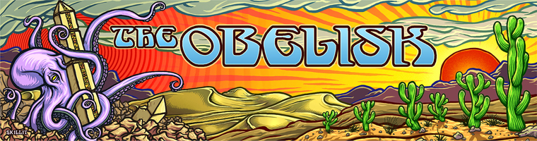
I gotta say, I felt like the coolest motherfucker on the planet when I opened the email attachment from Sean “Skillit” McEleny (website here) about an hour ago and saw the new banner for The Obelisk in all its glory. Feeling that way while checking my email is in itself is probably proof that I’m not, in fact, the coolest motherfucker on the planet, but the work still rules and I couldn’t be more stoked on it.
It’s up there now — click ‘refresh’ if you don’t see it — but I wanted to give a more detailed look at Skillit‘s design, because as you can see from the doomly purple octopus wrapped engulfing the obelisk in the red sky desert above, it’s fucking excellent.
Check out the dunes, ready for piloting:

And dig the sway of the cacti and the red sun, for which the logo (adapted and swaggered up from the original) has much blues:

In 760 pixels, Skillit managed to sum up so much of what this site is all about, the psychedelia, the heaviness, the doom, the stoner rock, and I can’t thank him enough for the time and effort he put into every little detail. Look at the shadows on the cacti! Or the waves in the red sky behind the octopus above. Or even the shading of the rocks. It’s all so killer, it makes me want to write copy that lives up to it.
So thanks once again to Skillit for making this possible. Make sure you check out the Skillit-Art website to see more of his work for SHoD, Days of the Doomed, Dali’s Llama, Fatso Jetson, Blaak Heat Shujaa, Admiral Browning and many, many more. His Thee Facebooks gallery is also home to much badassery, and a great way to get in touch with him to hire him for design work or just to tell him how awesome he is for coming up with stuff like this. Whatever else you do, I’d obviously recommend that.


