
The Obelisk Presents: 12 of 2017’s Best Album Covers
Posted in Features, Visual Evidence on December 11th, 2017 by JJ KoczanThe whole point of this list is that it’s not exhaustive. I feel like I say this every year, but it’s not meant to be the best covers of 2017. How would I even begin to judge that kind of thing? Appreciation for visual art is so subjective that, even in a niche within a niche within a niche like the cover pieces for heavy rock and/or doom and/or psych records, the sphere is simply too vast. I just want to have a good time looking at kickass album covers. That’s really it.
Of course, there’s always plenty of fare ready and waiting. I kept a running list all year of things that really stuck out to me, and there are some familiar names here along with some newcomers. My gripe with the proliferation of cartoon tits continues and grows even more fervent as the political climate in which this stuff happens — because even riffs don’t occur in a vacuum, sorry — becomes increasingly fraught, problematic and outright heinous, but there doesn’t seem to be any slowing that particular patriarchal train in this bizarre subculture. Dudes gotta be objectifying women and such to make up for the disaffection they feel from society at large. Weak. Grow up.
And again — I said this last year too — but I’m a fucking hypocrite because of the 14 artists listed in these 12 covers, there isn’t one woman included. Not one. I looked at my list and hung my fool head in self-disappointment. Fortunately, looking at awesome artwork is the kind of thing from which I derive emotional comfort. It’s been a real rollercoaster putting this one together, I guess.
Alright, enough delay. If you’ve got favorites that you don’t see here — and I’m sure you do because I do as well — please let me know in the comments. Thanks in advance for not being a jerk.
Here goes:
Ordered alphabetically by artist
Alunah, Solennial
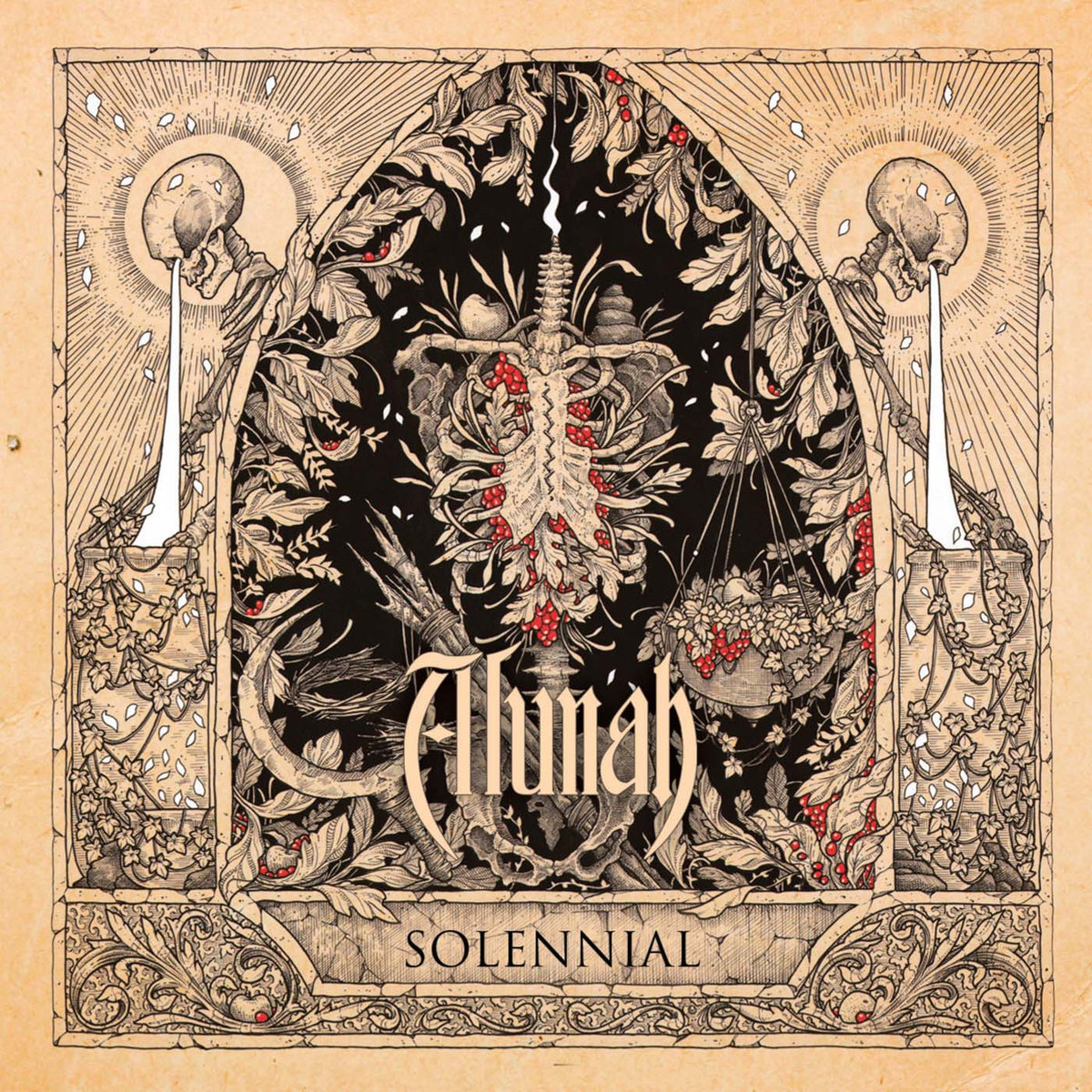
Cover by Adrian Baxter. Thee Facebooks.
Though it was Alunah‘s 2014 album, Awakening the Forest (review here), that found Michael Cowell introducing the framing style and color scheme used on their latest offering as well, Adrian Baxter‘s piece for the Birmingham outfit’s fourth LP and Svart Records label debut, Solennial (review here), is an utter standout. Themes of death and life and nature echo the organic feel always on display throughout Alunah‘s songwriting, and amid the highly detailed line drawing, the flashes of red evoke the richness of blood to comport with the skeletons and the vines twisted about like innards, subtly reminding of the band’s pagan and forest-canopy ethereality.
—
Brume, Rooster

Cover by Shaun Beaudry. Artist gallery.
Shaun Beaudry does a lot of work in pen and ink and coffee stain, and like many of his pieces, the cover art for Rooster (review here), the Doom Stew/DHU Records debut album from San Francisco three-piece Brume, seems like it’s tailor-made to be a tattoo. More than that, what strikes me about it is the sense of narrative happening with the serpent-bird, the eggs, the coiling around what would seem to be an unfortunate scavenger and the dandelions and leaves surrounding. Each element looks like it’s giving messages, holding meaning, communicating ideas, and with such exquisite detail, the effect on the viewer is all the more immersive.
—
Cloud Catcher, Trails of Kozmic Dust

Cover by Adam Burke. Artist website.
I imagine that, one way or another, every time I post a list like this it will feature a cover by Adam Burke. In 2017, in addition to the art for Cloud Catcher‘s Trails of Kozmic Dust (review here), the man behind Nightjar Illustration (and who did one of this site’s headers and the cover art for my book) also blasted out mention-worthy pieces topping records by Sólstafir and Spectral Haze, and his epic oil-on-canvas fantasy-art style always manages to stun. Look at the sense of scale in the Cloud Catcher cover, and the way that, as we see this cosmic battle happening, the stars seem to bleed through the two warriors, as though we’re looking at something happening across dimensions. And so we are. Beautiful.
—
Elder, Reflections of a Floating World
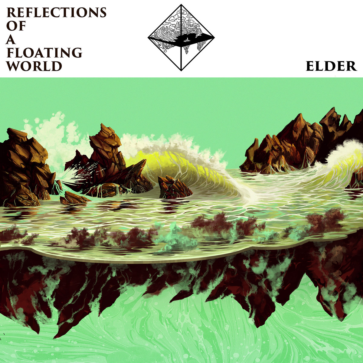
Cover by Adrian Dexter. Artist website.
A continued collaboration between Elder and Adrian Dexter yielded dividends once again with the artwork for Reflections of a Floating World (review here), released by Stickman Records and Armageddon Shop. Perhaps it’s not fair to include just the cover in this list since in my head I’m picturing the full LP’s swath of visuals, but even just in this single piece, Dexter gorgeously mirrors (get it? because “reflections?”) the band’s progressive stylizations with his own, evoking classic, stare-at-it-for-hours, poster-ready artwork and seeming to leave one wondering which end of the reflection is up and which is down in much the same way as the band’s dizzying complexity of songcraft.
—
The Riven, Blackbird
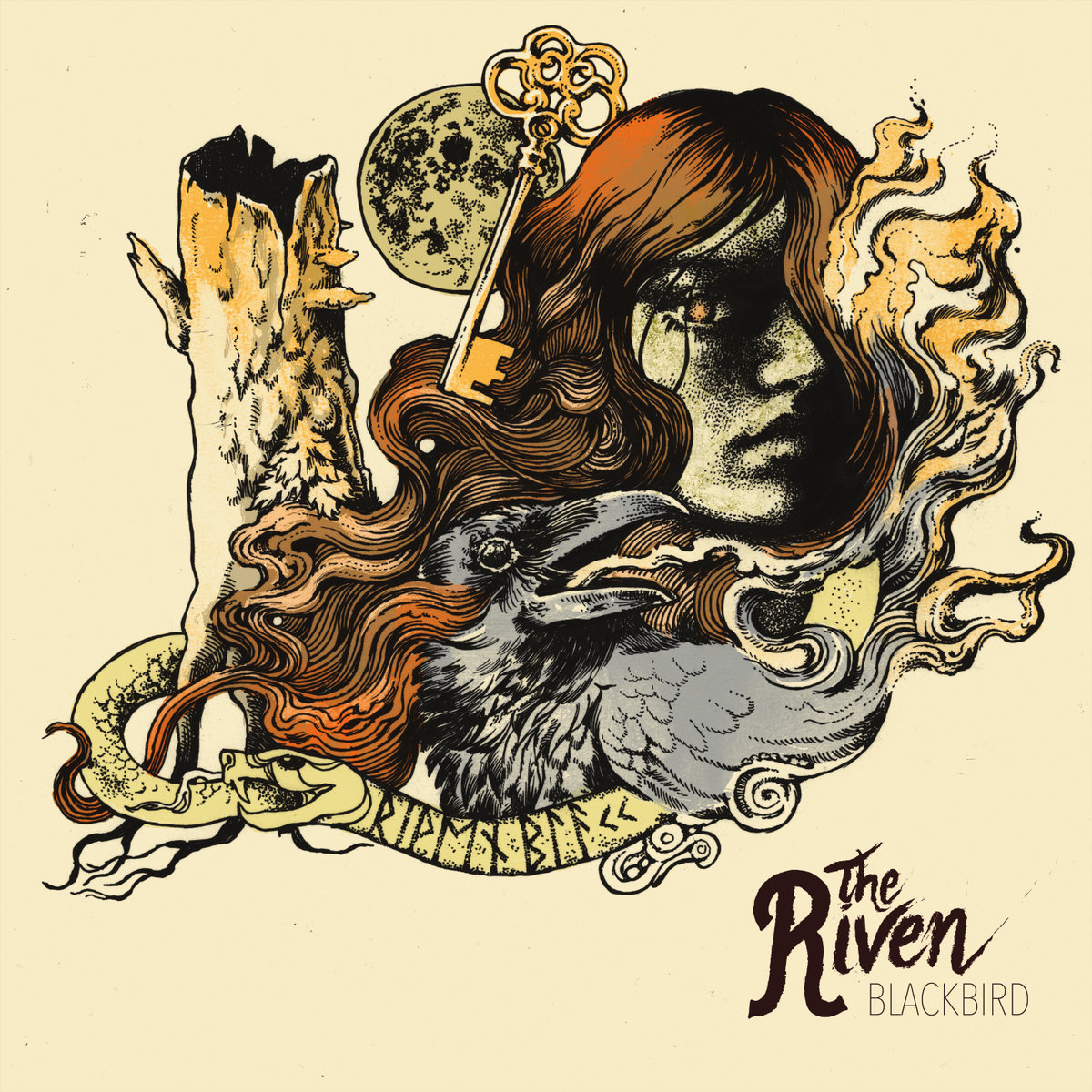
Cover by Maarten Donders. Artist website.
In their video for “Killer on the Loose” (posted here), London-based heavy soul rockers The Riven play before a backdrop with the same Maarten Donders artwork on it as their debut EP, Blackbird. Donders is another repeat offender as far as appearances on this list go, and the many-time Roadburn poster collaborator’s detailed style, classic form and muted colors provide a feeling of warmth that seems almost like a goal The Riven are trying to achieve in their sound. From the moon, to the key, to the face being obliterated in smoke, the blackbird itself, the rune-laden ouroboros, the dead and hollow tree trunk, each element of the Blackbird cover holds a mystery of its own, and yet it all fits together perfectly as well, as though the art was a puzzle only Donders could piece together. I’d make a banner out of it, too.
—
Wight, Atlas
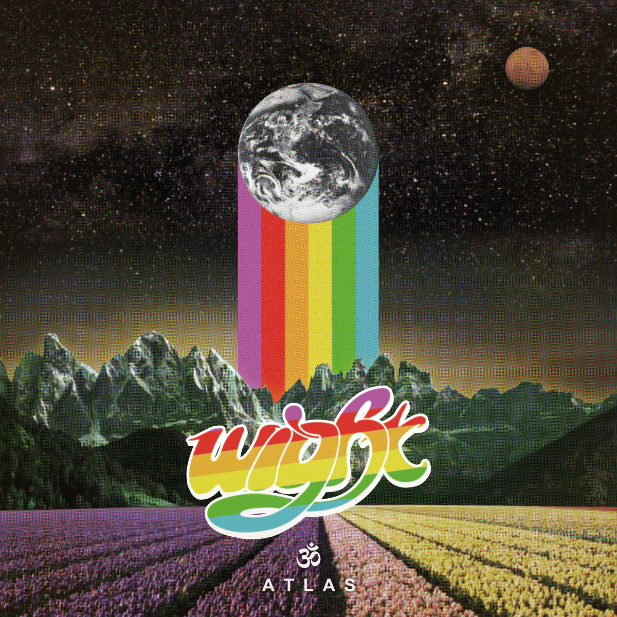
Cover by René Hofmann. Band website.
Of the 12 covers featured on this list, René Hofmann‘s piece for Wight‘s 2017 H42 Records single, Atlas (review here), is the only one done by a member of the band itself. And I won’t lie: it’s the rainbow that sealed the deal for me. The fade from purple to yellow and sense of perspective in the rows of flowers at the bottom draw the eye toward the band’s logo, and with the mountains behind, that horizontal (angled diagonally) burst of color leads upward to the vertical color bars that seem to be holding up Planet Earth itself or are otherwise left in its path. That brazen use of color, especially with the darkness of the sky behind, was striking, hopeful and joyous in a year that seemed to need precisely as much of that as it could possibly get.
—
Unearthly Trance, Stalking the Ghost
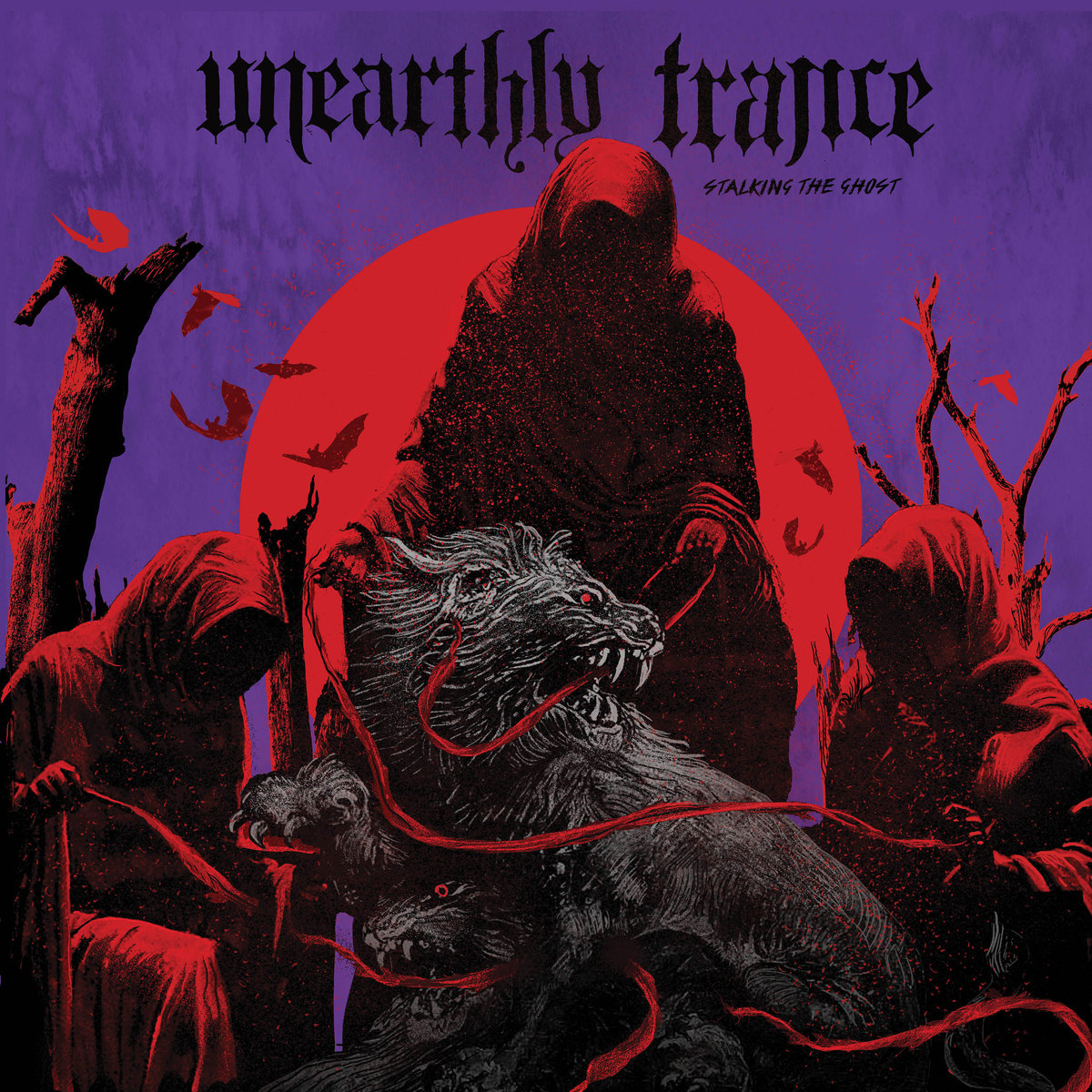
Cover by Orion Landau. Artist Tumblr.
One has to wonder if, in his choice of red and purple hues, if Relapse Records in-house artist Orion Landau wasn’t specifically looking to reference Black Sabbath‘s Born Again in the artwork for Unearthly Trance‘s Stalking the Ghost (review here). Could we be looking at the devil-baby from that 1983 record all grown up in 2017? And could that reference itself be a clever manner of noting that it’s a reunion album for the band? That they’re, in essence, born again? Either way, the three hooded figures and the beast they’ve leashed are a haunting enough presence to fit with the LP’s title and the atmospherics of the group itself, while also being emblematic of the precision and detail Landau brings to the diverse range of work he does for Relapse artists across various realms of extremity and metal.
—
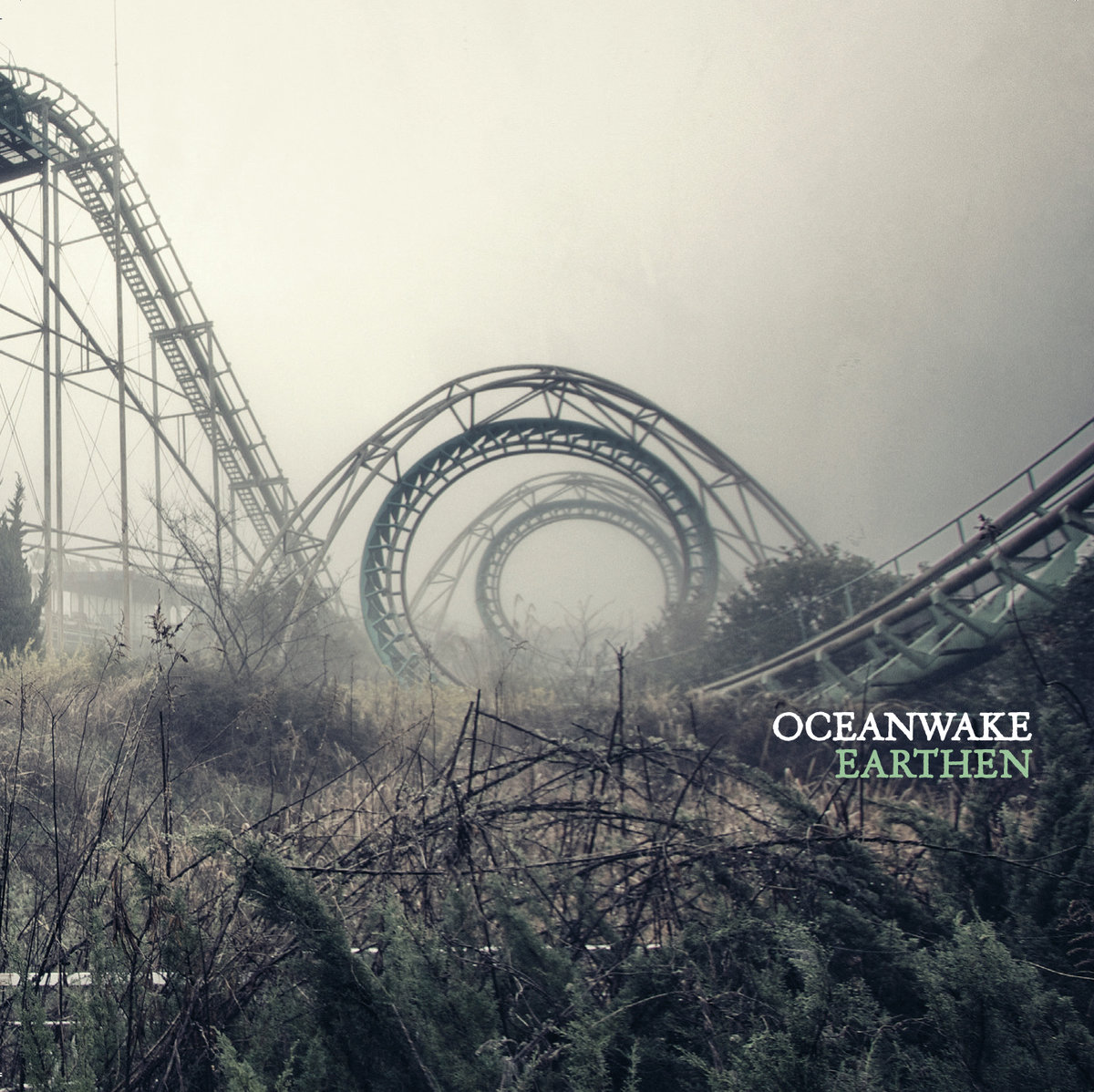
Cover by Chris Luckhardt. Artist website.
The framing of the photo is a big part of the draw here, of course. The spiral of the abandoned rollercoaster. Oceanwake‘s Earthen (review here) seemed to set the goal of living up to its cover atmospherically and with the Kubrick-style framing of the abandoned rollercoaster that pulls the eye inward, almost like you’re looking down and not straight ahead, journeyman photographer Chris Luckhardt captured a murk that set a high standard indeed. The metaphor is laid on a little thick, to be sure — it isn’t subtle — but neither is the sound of Oceanwake, and the overarching greys and brooding vibe of the photo serve to genuinely affect the listening experience. Photo covers can be especially hard to pull off. This one does especially well to remain obscure even as its lines drag you in. Where does that coaster end up?
—
Argus, From Fields of Fire

Cover by Brad Moore. Artist website.
Anyone with any level of appreciation for classic metal should by rights be an admirer of Brad Moore. The standard applies. Dude has a knack for capturing the kind of imagery you might’ve tried to emulate on the front of your high school notebook, but just ended up with an indecipherable mess of lines and half-formed monsters. Argus‘ 2017 album, From Fields of Fire (review here), with its bizarre hellscape, calls to mind doom, the NWOBHM and even some more extreme, death metal records, but the point rings true that what’s happening here is horns-up, balls-out, no-irony, no-fucking-around metal, and the most majestic Argus offering yet deserved no less. The detail of Moore‘s lines, the root influence of fantasy art, and in this case especially, the setting of theme through the use of red made this one especially arresting.
—
Spidergawd, IV

Cover by Emile Morel. Artist website.
Easy pick. Sorry, but calling out Spidergawd art for being awesome is kind of low-hanging-fruit as far as critical assessment goes, as the fact is that’s been an essential element of what they’ve done all along across their four to-date full-lengths. The latest them, Spidergawd IV (review here), boasts the above piece by Emile Morel and inhabits the same pastel world as their past outings, but marks a turn for not having a human or semi-human figure as a part of the front cover. Instead we see an arachnid monster who may well represent the Norwegian band itself residing in a garden of fungi wonderfully rendered so that the colors almost obscure the danger lurking around. It’s very much to form, but does nothing to diminish its impact.
—
Process of Guilt, Black Earth
Cover by Hugo Santos and Pedro Almeida.
Granted, I said at the outset that this list wasn’t about rankings or picking favorites, and it’s not. I stand by that. However, no other album cover hit me as immediately hard as Process of Guilt‘s Black Earth (review here) with its photographed sculpture by Hugo Santos and Pedro Almeida. I don’t know who did what in terms of the division of labor in its making, but the horrific realism of the result has continued to haunt in the best way possible with its evocation of death, the spirit, the natural world and the contrast between light and dark. It seems so simple on the surface, but at the same time it’s so exacting in its position and its starkness that I can’t help but feel like it’s staring at me every time I see it, or more accurately, staring into me from someplace dark and other.
—
Rozamov, This Mortal Road
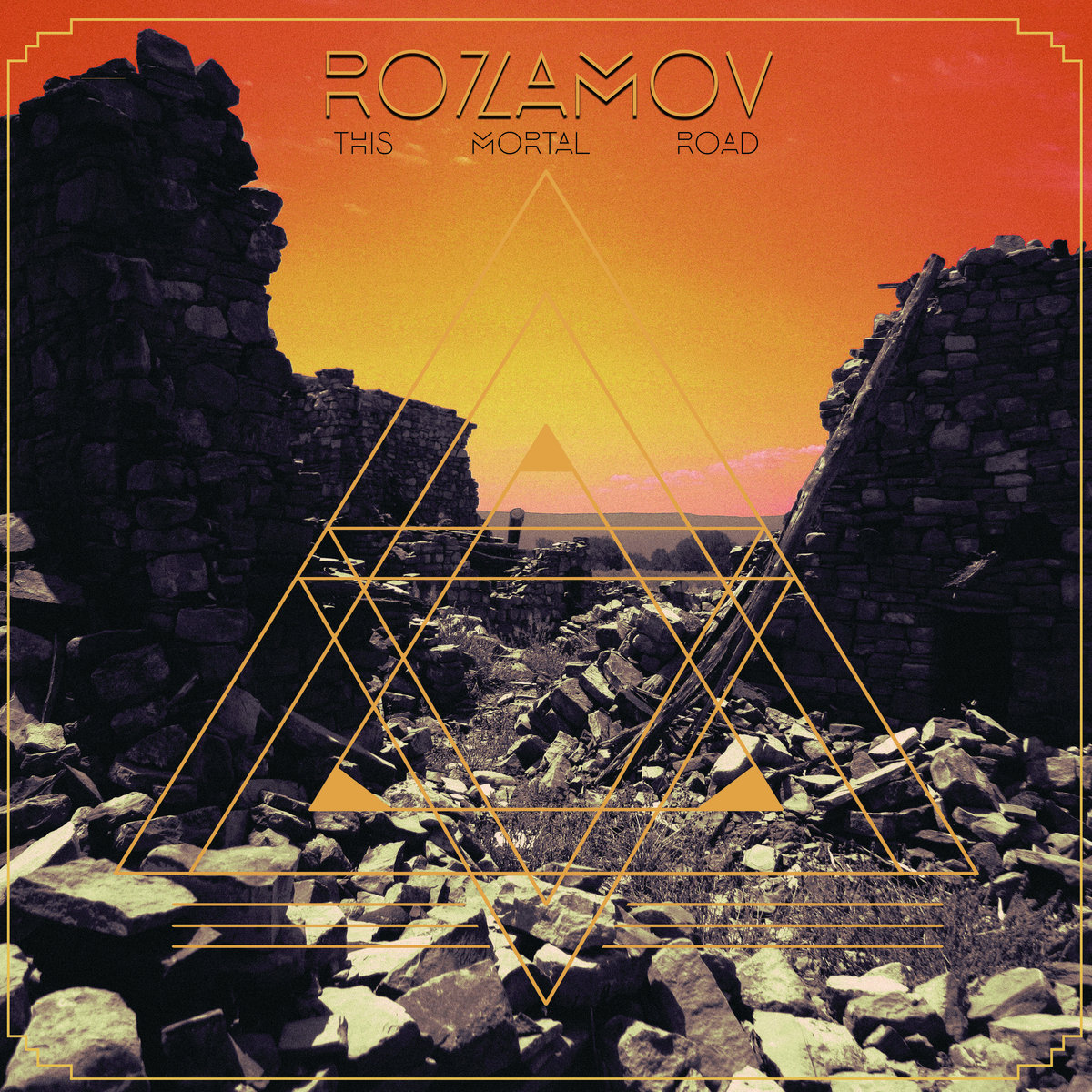
Cover by Andrew Weiss with layout by Matt Martinez. Artist website.
When I first saw the art for Rozamov‘s awaited Battleground Records debut long-player, This Mortal Road (review here), I was sure it had to be by Samantha Muljat. From the color wash in the sky to the otherworldly blend of photography and manipulation, to the geometric line-making overlaid, it just seemed to fit. Andrew Weiss, however, has done covers for Pelican, Spirit Adrift, and many others, and in concert with Matt Martinez‘s layout, his alien landscape is duly fraught and barren-looking while leaving the viewer to wonder if that’s a lone figure standing in the distance or just an oddly-shaped outcropping between the looming threat of the surrounding cavern walls. The message: there’s only one road ahead, only one way through it all.
—
A couple honorable mentions that I know I’ll add to as soon as this list goes live and I think of like 10 more records that looked awesome:
Bell Witch, Mirror Reaper
Lo-Pan, In Tensions
Godhunter, Codex Narco
Black Lung/Nap, Split 7″
Primitive Man, Caustic
So who did I miss? What were your favorite album covers of the year? Do you have a preferred style? Leave a comment with your picks and let’s get a conversation going. I know people feel strongly about this stuff, but please keep it civil so we can all have a good time.


