Posted in audiObelisk on May 6th, 2020 by JJ Koczan
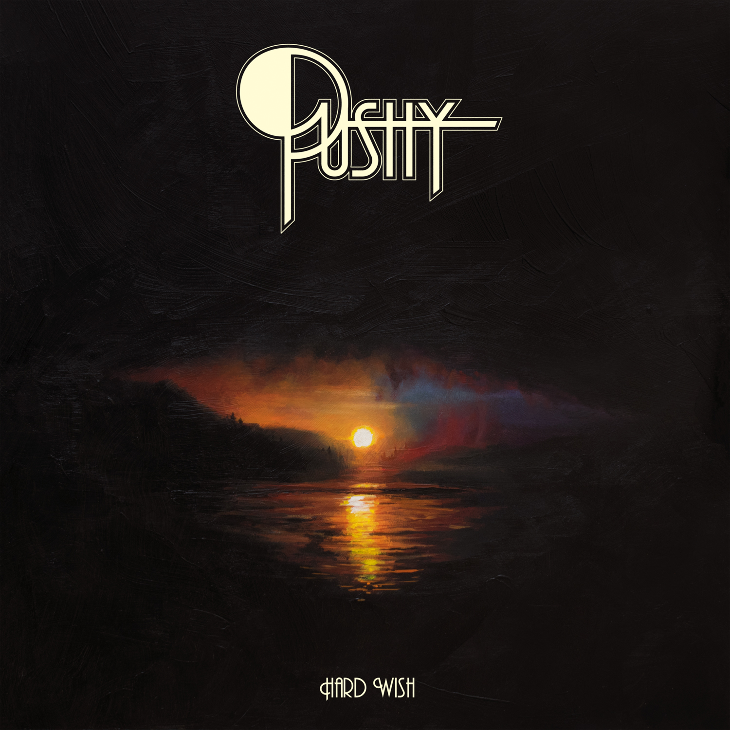
Hey, just so we’re clear and you don’t think I’m trying to put one over: this is decidedly not a premiere. Pushy‘s debut album, Hard Wish, originally came out in 2018 through Germany’s Who Can You Trust? Records, and hell, I did a premiere for it at the time, and I’m pretty sure it’s been on Bandcamp ever since, so no, not a premiere. But Tee Pee Records is giving the classic heavy rockin’ eight-tracker a domestic US look on vinyl this week, and that’s definitely enough of an occasion for me to want to host Hard Wish again. Not that good records need an excuse anyway, but you know what I mean.
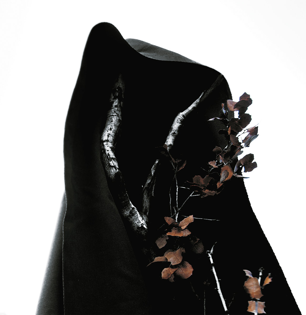
On guitar/vocals in the Portland, Oregon-based Pushy one finds Adam Burke, formerly of Fellwoods, and best known for the striking paintings he’s provided as cover art for everyone from Ruby the Hatchet to Hexvessel to this site to Fit for an Autopsy. He shares vocal duties with bassist Neal Munson, as Ron Wesley and Travis Clow round out the four-piece on guitar and drums, respectively, and across Hard Wish, they tap influences from earliest AC/DC, earliest King Crimson, earliest Judas Priest, not-quite-earliest Black Sabbath and a host of others brash, ballsy and boozed-up. Clow and Munson make a nodder highlight out of early cut “Blacktop,” but from “Fanny’s” to “I’ll Be Gentle,” the focus here is on attitude, on swagger, and songs like “El Hongo,” the driving “Lonesome Entry” and “Nasty Bag” have plenty of that, while “If I Cry” and closer “Lay of the Land” expand the palette a bit with some deceptively nuanced jams built around the live-feeling energy of the recording itself.
Bottom line is there’s plenty to dig here for ’70s aficionados and other-type heads looking for a groove to make their day, and really, again, I’m not trying to say this is a premiere — because it isn’t — but with the Tee Pee release of Hard Wish out this Friday (preorders below, if that’s your thing), I’m just glad to have a chance to revisit it, because it rocks and sometimes that’s just what you need. Anytime Pushy wants to get going on a follow-up, that’d be fine by me.
Please enjoy:
Portland-based hard rock outfit PUSHY are making waves in 2020. The band has announced that their debut album ‘Hard Wish’ will get a worldwide release on chocolate brown vinyl via Tee Pee Records. Boasting the unmistakable swagger and retro flair of rock n’ roll from a time when Woodstock was still young, Pushy descend upon listeners with boisterous, rabble rock vocals, raw, electric guitar riffs and natural percussion that feels all too authentic in contrast to the swath of modern music. Perhaps the most striking quality of Hard Wish is also its most plainly stated; that it sounds so sincerely like four musicians working harmoniously together as one in the same room.
The vinyl release of ‘Hard Wish’ is out May 8th on Tee Pee Records. Fans can pre-order the LP at the link found here.
‘Hard Wish’ Tracklisting: 1. Fanny’s 2. Nasty Bag 3. Blacktop 4. If I Cry 5. El Hongo 6. Lonesome Entry 7. I’ll Be Gentle 8. Lay of the Land
Pushy is: Guitar – Ron Wesley Drums – Travis Clow Bass, vocals – Neal Munson Vocals, guitar – Adam Burke
[Click play above to stream the premiere of ‘Blacktop’ by Pushy. Their debut album, Hard Wish, ships in July from Who Can You Trust? Records and is available to preorder now.]
Classic heavy rock played with conviction, heart and an obvious appreciation for the finer things in life when it comes to riffs — there’s a lot to like immediately about Pushy‘s debut album, Hard Wish. Delivered like their prior split 12″ with Ragged Barracudas (review here) through Who Can You Trust? Records, the awaited release from the Portland, Oregon, outfit conjures a fuzzy vision of ’70s heavy that does more than just boogie, though of course there’s plenty of that as well. From earliest AC/DC to Thin Lizzy, to ZZ TOP, to King Crimson, to a sudden turn from stripped-down KISS strut into an atmospheric prog-out on “If I Cry,” it’s record that makes a point of going where and doing what it damn well pleases, and it even manages to include a wah-drenched revamp of their catchy original demo, “El Hongo” (discussed here) and its eight-track/40-minute run makes for an engaging, organic, live-sounding listen that makes the advice “take it easy” seem like time-honored wisdom.
Comprised of guitarist/vocalist Adam Burke (formerly of Fellwoods), who’s also responsible for the paintings on the front and back of the LP, as well as having done art for this site and a universe of others, Crag Dweller‘s Travis Clow, Neal Munson of Billions and Billions and Ron Wesley of Hosmanek, the four-piece set an easygoing vibe from the very first crashes and shuffling grooves of opener “Fanny’s,” and while they might careen from one influence to the next and offer a bit of zleaze (yup, spelled with two ‘z’s) here and there, it’s all in good fun and Hard Wish succeeds in casting its own identity from the varied elements that make it up, whether that’s the gallop of “Nasty Bag” or the arena-rock grandiosity in the beginning of “If I Cry.”
And there’s a flow at work. Wrapping up side A after “Fanny’s” and second cut “Nasty Bag,” with its nyah-nyah-nyah opening and street-rocking swing, “Blacktop” offers a first glimpse of Pushy‘s progressive side, digging back to the first King Crimson record like it ain’t no thing and pairing that with a proto-burl riff that in most hands would be repelled from the prior stretch like magnets refusing to touch but is absolutely made to work here. By the time they’re rushing through delivering the title-line, Pushy have expanded the context of “Blacktop” an album’s worth, and the fuzzy nod that emerges from there and turns back to the central riff is pure gravy. Only then does “If I Cry” build on the prog edge of “Blacktop” with its own relatively patient beginning and midsection break, the guitars leading the way through about a minute of instrumental exploration that gives way to silence before a volume-swelling solo emerges to wind the way back to the central rhythm, which gets topped with its own victory-lap of a lead before they noodle their way to the end. From that somewhat hypnotic finish, “El Hongo” eases its way in to start off side B with room for a bit of its own psychedelic meandering amid a landmark-feeling hook that’s a standout from the album as a whole.
The boogie is writ large over the secondary leadoff, but at five minutes, it’s not necessarily a mirror of “Fanny’s” at the start of the record, which had a shorter clocktime and more straightforward structure without the midsection departure that some of the longer songs make. In that regard, “If I Cry” is something of a foreshadow for the 10-minute closer “Lay of the Land” that follows “El Hongo,” “Lonesome Entry,” and “I’ll Be Gentle,” the latter two of which are also of the shorter variety. No doubt that vinyl considerations came into play when putting together the tracklisting with four songs per side, getting the runtimes close, and so on, but it’s worth pointing out that it works exceedingly well in terms of the front-to-back, with “Fanny’s” setting the tone literally and figuratively while smoothing the way into “Nasty Bag” and the three tracks that follow before “Lonesome Entry,” which is the shortest of the bunch at 2:27, ignites a speedy Cactus-style brashness with Burke‘s vocals hitting a higher register to match the more frenetic pacing of the verses.
Naturally, those are offset by more midpaced transitional sections and though it’s the shortest inclusion at 2:27, Pushy still squeeze in those tempo shifts before the before the cold ending brings on “I’ll Be Gentle” brings forth more boogie vibes and hooks in both its verse and chorus. There’s a tongue-in-cheek aspect to the lyrics — if I’m not mistaken there’s a reference to a “velvet hand” — but the classic feel of the songwriting and the live-style vibe of the recording come through just the same as on “Lonesome Entry” and really everything else before it. And it’s fitting that the two shorter cuts should give way to “Lay of the Land” at the end of the record, which not only makes the most of its two guitars but brings the rhythm section as well to some of its finest moments.
It’s an unenviable task to summarize what Hard Wish has thus far brought forth in its scope of formative heavy, but most if it appears within the more extended finale, from the patient and progressive opening to the subdued verses and the greater build and release that happens later on. Some parts seem to be begging for organ accompaniment, but I guess one has to leave some ground to cover on a sophomore outing, and as their debut, Hard Wish basks in its inspirations without falling into boogie rock cliché — except where it wants to, as on “I’ll Be Gentle” — and sets up a balance of straight-ahead and more exploratory movements to be toyed with from here on out. It’s a sound that, should Pushy be interested in such things, they can keep growing and expanding, since as we know the realm of classic heavy rock is by no means relegated to the past, and the chemistry between players on display throughout Hard Wish is of the sort that can’t be faked, least of all in such a stage-born-sounding context. From a Pacific Northwest so bent on partying, Pushy bring just a touch of class to the proceedings and remind that not all good times need to be overblown to be memorable.
Posted in Whathaveyou on May 31st, 2018 by JJ Koczan
With a July 16 ship date, preorders are up for the awaited full-length debut from Portland, Oregon, classic heavy rockers Pushy. Dubbed Hard Wish in apparent homage to just how much I’d like my seven-month-old son to take his morning nap right now, the album follows a 2016 split with Germany’s Ragged Barracudas (review here), as well as an earlier 2015 two-songer, If I Cried, named in apparent — and prescient! — homage to that same seven-month-old’s question that if he just screams for 45 solid minutes, will it be enough to make me go upstairs and end his apparent torture. In answer: no.
Anyhoozle, I’ve been waiting for Pushy‘s debut since I heard their demo (discussed here) in 2014, and the group sound like they’ve got their boogie in fine working order on the first public audio to come from Hard Wish, which is second track “Nasty Bag,” which you’ll find streaming at the bottom of this post, along with the preorder link preceded by a snazzy bio.
From the PR wire:
Pushy – Hard Wish
Have you ever watched the 1977 video of Ram Jam playing “Black Betty” in somebody’s front yard and asked yourself, “Why don’t we have bands who party like that anymore?” And after the very first time you witnessed a young bellbottomed James Gang set up their gear in the Mexicali desert and riff through “Laguna Salada” during the opening credits to the 1971 film Zachariah, did you ask yourself, “Are there even any bands this good today?” Or what about that time you laid virgin eyes upon the gatefold to ZZ Top’s Tres Hombres and took in a panoramic photograph that could only be described as a taqueria orgy? Did you ask, “Why can’t a newer style band make me feel this special?”
The answer to all these questions lives and pulses within the four musicians who comprise the Portland, Oregon based hard rock quartet, Pushy. If your ears have yet to be seduced by the God-hammered choogle of Pushy, it’s not too late for you. Their debut album Hard Wish has been captured in the band’s natural element and then released into the wild by the good people of Who Can You Trust? Records – a label that knows how and where to mine the rich ore of timeless rock ‘n’ roll. If the hot buttered distortion of the opening song “Fanny’s” (with its saucy boogie and howling guitar leads) doesn’t put an electric strut in your butt, there’s a pretty good chance that rock ‘n’ roll may be none of your business.
John Fogerty once sang that the people on the river are happy to give. But if you listen closely to the hard and heavy stomp of “Nasty Bag,” it sounds like the people on the river are waiting to kill you. Pushy have the power of rock surging through their veins and sometimes this power channels stories and spirits to help move you into parallel dimensions. Take “El Hongo” for instance – between Ron Wesley coaxing a gold top Les Paul to scream and wail through a tweed Victoria Bassman, and Adam Burke crooning for us to take it easy and close our eyes, there could never exist a reason why we would ever want to not keep on chooglin’. And when Travis Clow and Neal Munson kick off the album’s bookend jam “Lay of the Land” with their callused hands working a well-oiled rhythm section, you can almost smell the grease burning on the gears as the bass and drums pump out a loose and juicy groove that’s just begging for the guitars to rain riffs like there’s a storm in hell and we’re all invited to hang out and drink their beer.”
The whole point of this list is that it’s not exhaustive. I feel like I say this every year, but it’s not meant to be the best covers of 2017. How would I even begin to judge that kind of thing? Appreciation for visual art is so subjective that, even in a niche within a niche within a niche like the cover pieces for heavy rock and/or doom and/or psych records, the sphere is simply too vast. I just want to have a good time looking at kickass album covers. That’s really it.
Of course, there’s always plenty of fare ready and waiting. I kept a running list all year of things that really stuck out to me, and there are some familiar names here along with some newcomers. My gripe with the proliferation of cartoon tits continues and grows even more fervent as the political climate in which this stuff happens — because even riffs don’t occur in a vacuum, sorry — becomes increasingly fraught, problematic and outright heinous, but there doesn’t seem to be any slowing that particular patriarchal train in this bizarre subculture. Dudes gotta be objectifying women and such to make up for the disaffection they feel from society at large. Weak. Grow up.
And again — I said this last year too — but I’m a fucking hypocrite because of the 14 artists listed in these 12 covers, there isn’t one woman included. Not one. I looked at my list and hung my fool head in self-disappointment. Fortunately, looking at awesome artwork is the kind of thing from which I derive emotional comfort. It’s been a real rollercoaster putting this one together, I guess.
Alright, enough delay. If you’ve got favorites that you don’t see here — and I’m sure you do because I do as well — please let me know in the comments. Thanks in advance for not being a jerk.
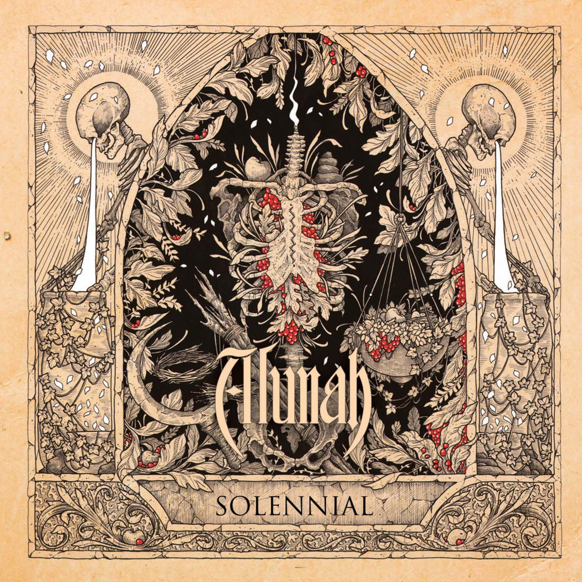
Though it was Alunah‘s 2014 album, Awakening the Forest(review here), that found Michael Cowell introducing the framing style and color scheme used on their latest offering as well, Adrian Baxter‘s piece for the Birmingham outfit’s fourth LP and Svart Records label debut, Solennial (review here), is an utter standout. Themes of death and life and nature echo the organic feel always on display throughout Alunah‘s songwriting, and amid the highly detailed line drawing, the flashes of red evoke the richness of blood to comport with the skeletons and the vines twisted about like innards, subtly reminding of the band’s pagan and forest-canopy ethereality.
Shaun Beaudry does a lot of work in pen and ink and coffee stain, and like many of his pieces, the cover art for Rooster (review here), the Doom Stew/DHU Records debut album from San Francisco three-piece Brume, seems like it’s tailor-made to be a tattoo. More than that, what strikes me about it is the sense of narrative happening with the serpent-bird, the eggs, the coiling around what would seem to be an unfortunate scavenger and the dandelions and leaves surrounding. Each element looks like it’s giving messages, holding meaning, communicating ideas, and with such exquisite detail, the effect on the viewer is all the more immersive.
I imagine that, one way or another, every time I post a list like this it will feature a cover by Adam Burke. In 2017, in addition to the art for Cloud Catcher‘s Trails of Kozmic Dust (review here), the man behind Nightjar Illustration (and who did one of this site’s headers and the cover art for my book) also blasted out mention-worthy pieces topping records by Sólstafir and Spectral Haze, and his epic oil-on-canvas fantasy-art style always manages to stun. Look at the sense of scale in the Cloud Catcher cover, and the way that, as we see this cosmic battle happening, the stars seem to bleed through the two warriors, as though we’re looking at something happening across dimensions. And so we are. Beautiful.
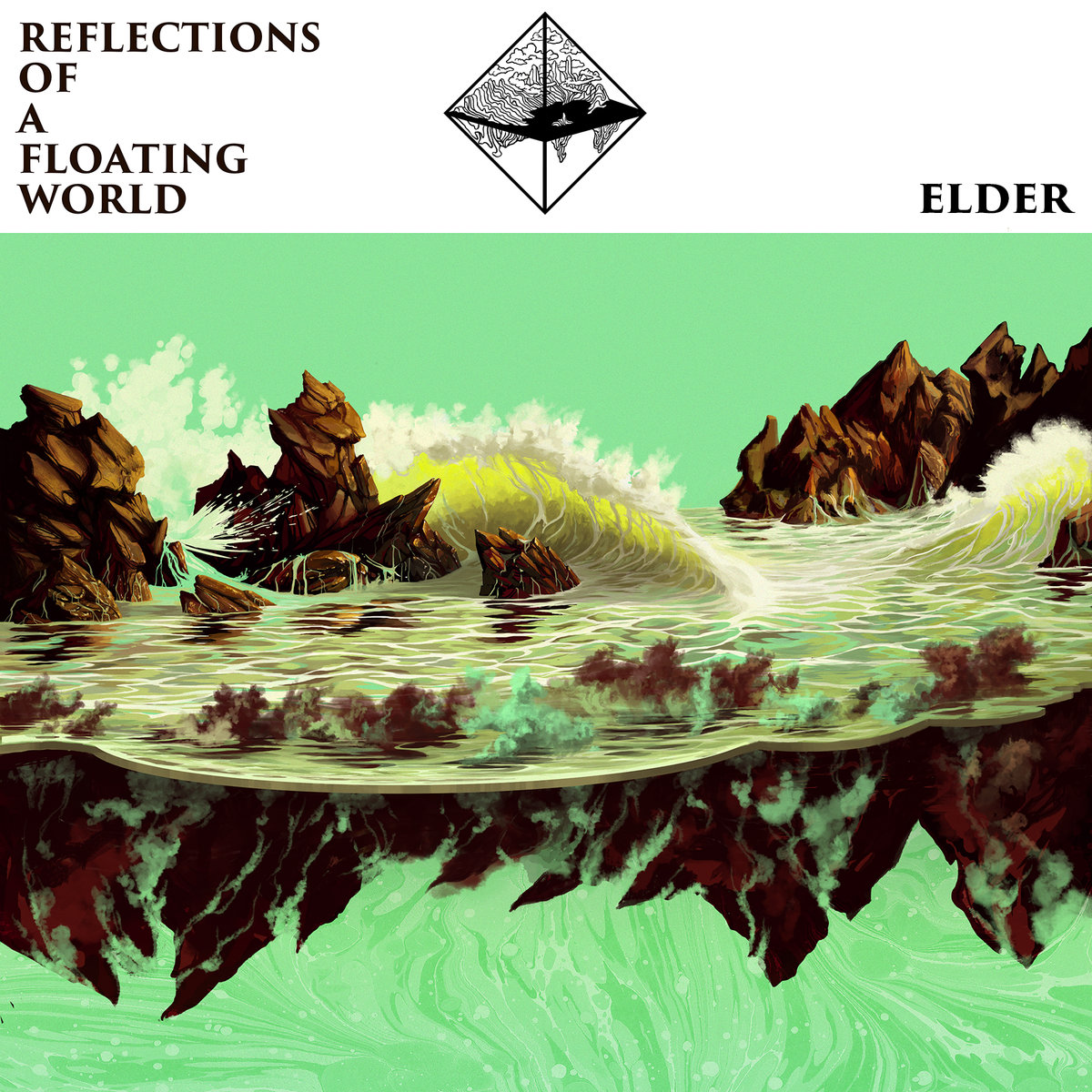
A continued collaboration between Elder and Adrian Dexter yielded dividends once again with the artwork for Reflections of a Floating World (review here), released by Stickman Records and Armageddon Shop. Perhaps it’s not fair to include just the cover in this list since in my head I’m picturing the full LP’s swath of visuals, but even just in this single piece, Dexter gorgeously mirrors (get it? because “reflections?”) the band’s progressive stylizations with his own, evoking classic, stare-at-it-for-hours, poster-ready artwork and seeming to leave one wondering which end of the reflection is up and which is down in much the same way as the band’s dizzying complexity of songcraft.
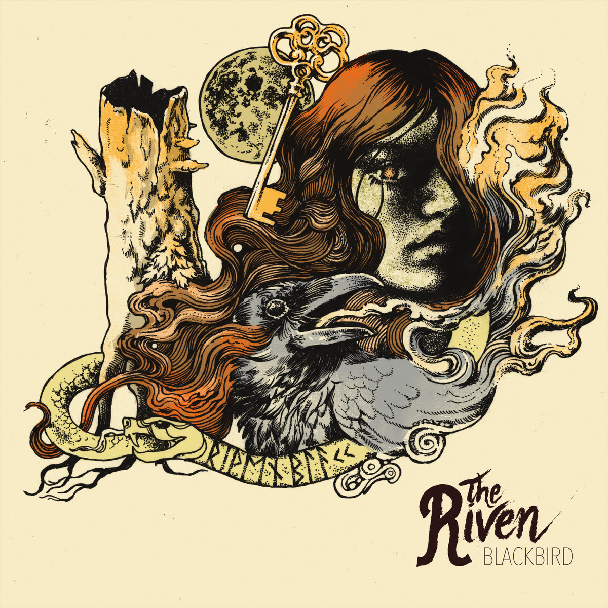
In their video for “Killer on the Loose” (posted here), London-based heavy soul rockers The Riven play before a backdrop with the same Maarten Donders artwork on it as their debut EP, Blackbird. Donders is another repeat offender as far as appearances on this list go, and the many-time Roadburn poster collaborator’s detailed style, classic form and muted colors provide a feeling of warmth that seems almost like a goal The Riven are trying to achieve in their sound. From the moon, to the key, to the face being obliterated in smoke, the blackbird itself, the rune-laden ouroboros, the dead and hollow tree trunk, each element of the Blackbird cover holds a mystery of its own, and yet it all fits together perfectly as well, as though the art was a puzzle only Donders could piece together. I’d make a banner out of it, too.
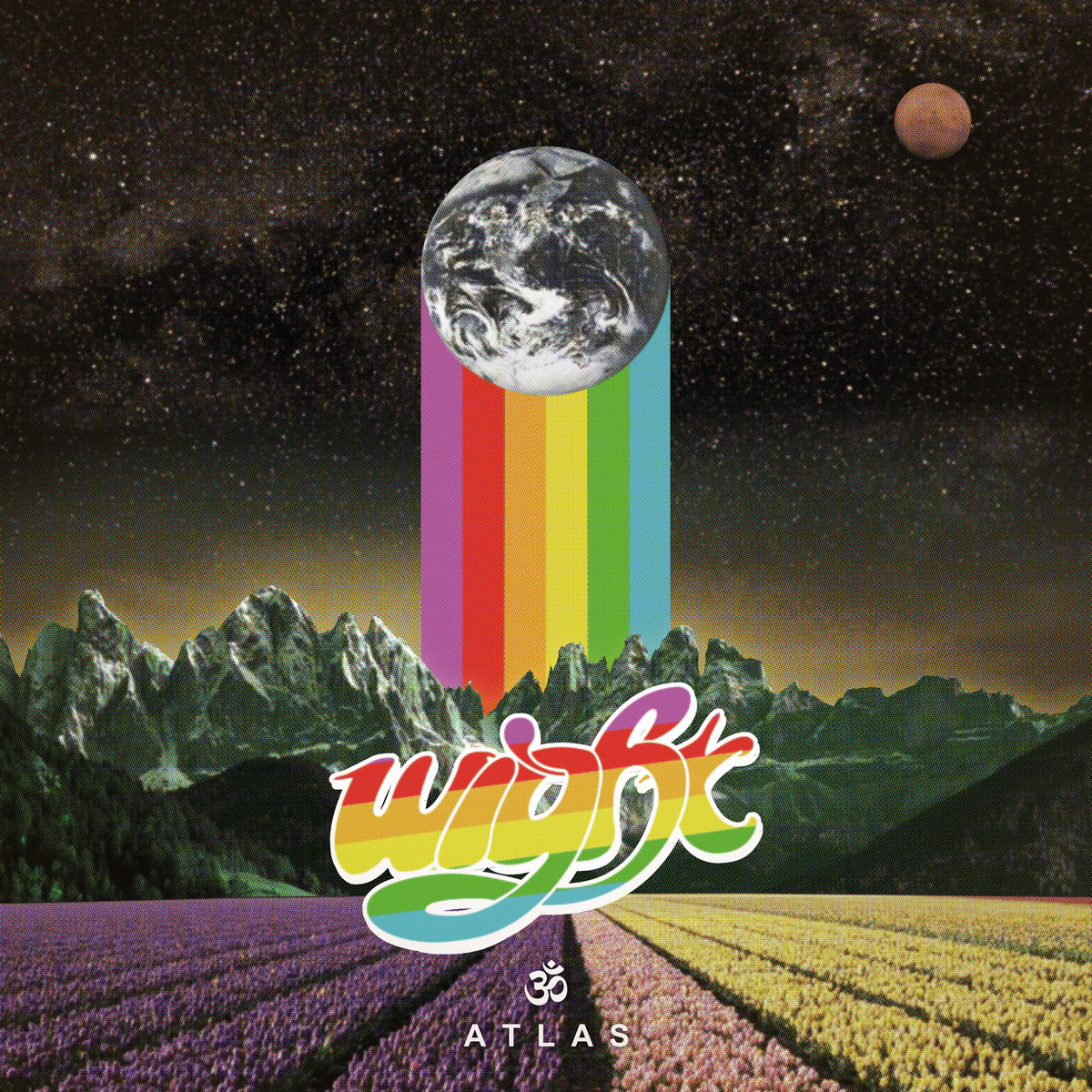
Of the 12 covers featured on this list, René Hofmann‘s piece for Wight‘s 2017 H42 Records single, Atlas(review here), is the only one done by a member of the band itself. And I won’t lie: it’s the rainbow that sealed the deal for me. The fade from purple to yellow and sense of perspective in the rows of flowers at the bottom draw the eye toward the band’s logo, and with the mountains behind, that horizontal (angled diagonally) burst of color leads upward to the vertical color bars that seem to be holding up Planet Earth itself or are otherwise left in its path. That brazen use of color, especially with the darkness of the sky behind, was striking, hopeful and joyous in a year that seemed to need precisely as much of that as it could possibly get.
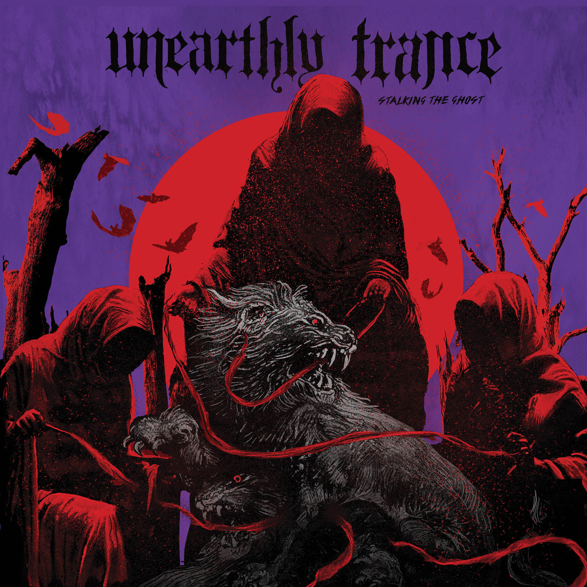
One has to wonder if, in his choice of red and purple hues, if Relapse Records in-house artist Orion Landau wasn’t specifically looking to reference Black Sabbath‘s Born Again in the artwork for Unearthly Trance‘s Stalking the Ghost (review here). Could we be looking at the devil-baby from that 1983 record all grown up in 2017? And could that reference itself be a clever manner of noting that it’s a reunion album for the band? That they’re, in essence, born again? Either way, the three hooded figures and the beast they’ve leashed are a haunting enough presence to fit with the LP’s title and the atmospherics of the group itself, while also being emblematic of the precision and detail Landau brings to the diverse range of work he does for Relapse artists across various realms of extremity and metal.
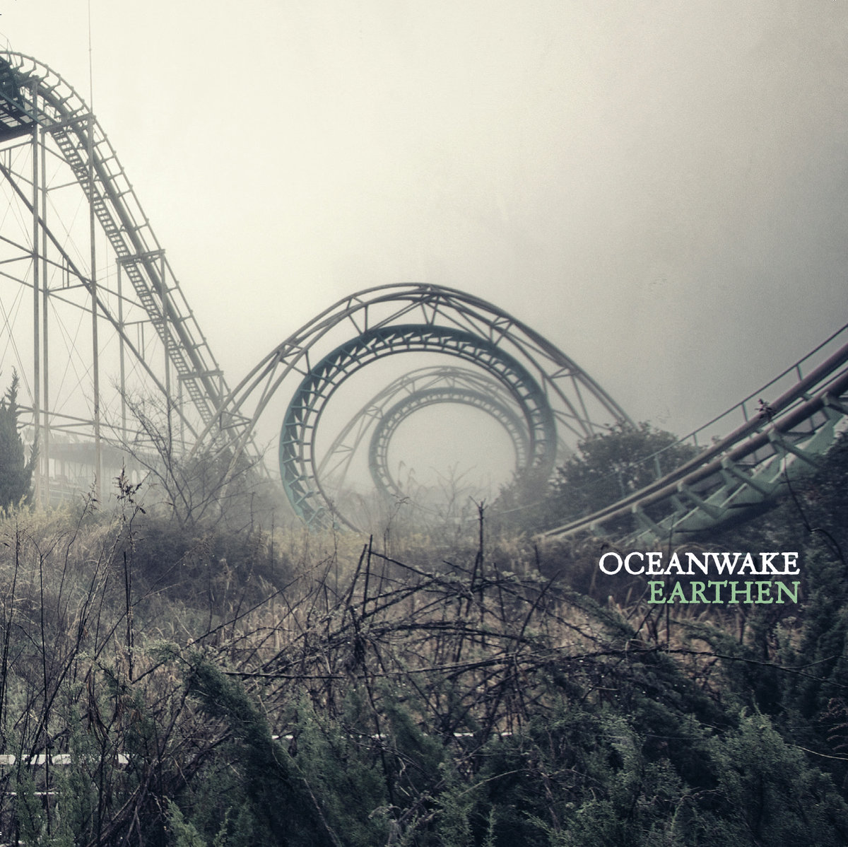
The framing of the photo is a big part of the draw here, of course. The spiral of the abandoned rollercoaster. Oceanwake‘s Earthen (review here) seemed to set the goal of living up to its cover atmospherically and with the Kubrick-style framing of the abandoned rollercoaster that pulls the eye inward, almost like you’re looking down and not straight ahead, journeyman photographer Chris Luckhardt captured a murk that set a high standard indeed. The metaphor is laid on a little thick, to be sure — it isn’t subtle — but neither is the sound of Oceanwake, and the overarching greys and brooding vibe of the photo serve to genuinely affect the listening experience. Photo covers can be especially hard to pull off. This one does especially well to remain obscure even as its lines drag you in. Where does that coaster end up?
Anyone with any level of appreciation for classic metal should by rights be an admirer of Brad Moore. The standard applies. Dude has a knack for capturing the kind of imagery you might’ve tried to emulate on the front of your high school notebook, but just ended up with an indecipherable mess of lines and half-formed monsters. Argus‘ 2017 album, From Fields of Fire (review here), with its bizarre hellscape, calls to mind doom, the NWOBHM and even some more extreme, death metal records, but the point rings true that what’s happening here is horns-up, balls-out, no-irony, no-fucking-around metal, and the most majestic Argus offering yet deserved no less. The detail of Moore‘s lines, the root influence of fantasy art, and in this case especially, the setting of theme through the use of red made this one especially arresting.
Easy pick. Sorry, but calling out Spidergawd art for being awesome is kind of low-hanging-fruit as far as critical assessment goes, as the fact is that’s been an essential element of what they’ve done all along across their four to-date full-lengths. The latest them, Spidergawd IV (review here), boasts the above piece by Emile Morel and inhabits the same pastel world as their past outings, but marks a turn for not having a human or semi-human figure as a part of the front cover. Instead we see an arachnid monster who may well represent the Norwegian band itself residing in a garden of fungi wonderfully rendered so that the colors almost obscure the danger lurking around. It’s very much to form, but does nothing to diminish its impact.
—
Process of Guilt, Black Earth
Cover by Hugo Santos and Pedro Almeida.
Granted, I said at the outset that this list wasn’t about rankings or picking favorites, and it’s not. I stand by that. However, no other album cover hit me as immediately hard as Process of Guilt‘s Black Earth (review here) with its photographed sculpture by Hugo Santos and Pedro Almeida. I don’t know who did what in terms of the division of labor in its making, but the horrific realism of the result has continued to haunt in the best way possible with its evocation of death, the spirit, the natural world and the contrast between light and dark. It seems so simple on the surface, but at the same time it’s so exacting in its position and its starkness that I can’t help but feel like it’s staring at me every time I see it, or more accurately, staring into me from someplace dark and other.
—
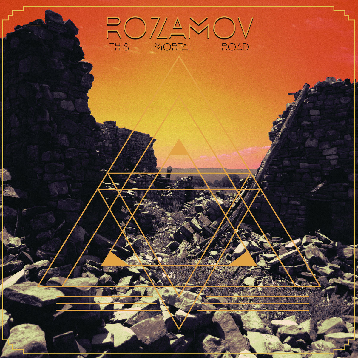
Rozamov, This Mortal Road
Cover by Andrew Weiss with layout by Matt Martinez. Artist website.
When I first saw the art for Rozamov‘s awaited Battleground Records debut long-player, This Mortal Road (review here), I was sure it had to be by Samantha Muljat. From the color wash in the sky to the otherworldly blend of photography and manipulation, to the geometric line-making overlaid, it just seemed to fit. AndrewWeiss, however, has done covers for Pelican, Spirit Adrift, and many others, and in concert with Matt Martinez‘s layout, his alien landscape is duly fraught and barren-looking while leaving the viewer to wonder if that’s a lone figure standing in the distance or just an oddly-shaped outcropping between the looming threat of the surrounding cavern walls. The message: there’s only one road ahead, only one way through it all.
—
A couple honorable mentions that I know I’ll add to as soon as this list goes live and I think of like 10 more records that looked awesome:
Bell Witch, Mirror Reaper Lo-Pan, In Tensions Godhunter, Codex Narco Black Lung/Nap, Split 7″ Primitive Man, Caustic
So who did I miss? What were your favorite album covers of the year? Do you have a preferred style? Leave a comment with your picks and let’s get a conversation going. I know people feel strongly about this stuff, but please keep it civil so we can all have a good time.
Posted in Whathaveyou on August 7th, 2017 by JJ Koczan
I’m not entirely sure how long Spectral Haze‘s Turning Electric has been in the works, or if the band even deigns to recognize the linear motion of our space-time continuum, but it seems like it might be a while. In 2015, the Oslo, Norway, heavy psych/space rockers posted a notice about new t-shirts coming soon and said “prepare to turn electric” as a part of that, so at very least they’ve been sitting on the title for some time. They signed to France-based imprint Totem Cat Records at the end of last year and said at that point that the record would be out in May, so its current Oct. 20 release date is the end result of some delay as well — reportedly owing to the usual concerns of pressing vinyl.
What matters, of course, is that the album is coming out. Then a five-piece and apparently having some fluidity of lineup anyhow, Spectral Haze made their debut in late 2014 with I.E.V.: Transmutated Nebula Remains (review here) via Soulseller Records, which followed a self-titled 2012 demo EP that you can still hear on their Bandcamp. Speaking of audio, the now-foursome are giving a first taste of what’s to come on Turning Electric by means of streaming the title-track, which is only 3:42 long, but still gives a sense of the cosmic thrust they’re working with anyhow, as excellently complemented by the gorgeous Adam Burke cover art that’s also newly unveiled.
I mean seriously, just look at this thing. I could do a year-end list of the best artwork and just have it all be Burke covers. Hell, maybe I should.
While I kick that idea around, here’s that cover and release date confirmation from the label, followed by the song stream:
Totem Cat Records – COMING NEXT / Spectral Haze – Turning Electric
Available October 20 on CD/LP Artwork by Adam Burke
Psyched Out Doom Rock Rituals
Spectral Haze is: Spacewülff – Interstellar Howls/Geetarrrgh Sönik Slöth – Supercosmic overdrive pedalinfused guitarvoid Döômdögg – Dronemachinated AUM Cëlestïal Cöbra – Conjurer of souls through ritual drums
Occasional appearances: Elêctrïc Stårlïng – Space wizard beckoning astral animal guardians, manipulating aether Pòwêr Pänthêr – Percussive boddhisattva, aspect of the conjuring ritual drums
This list could easily go to 20. Or 30. Or 50. The democratization of media and the flourishing of aesthetic thanks to wide-open digital interaction across national and cultural borders has meant that bands in Texas can get artwork from Spain easily — something we’ve come to take for granted in this age of messages flying through space in indeterminate instants. There’s a lot of art out there. A lot of it is very, very good. Not all, but a lot.
In the particular realm of heavy rock and doom, I’ve spent a lot of time this year being discouraged at the continued and apparently flourishing objectification of women. Cartoon tits. Get out of here with that shit. You’ll notice none of the covers on this list go that route. It’s boring, it’s easy and it’s sexist. If you want to establish your masculine dominance, go pull your dick out at the mall and see how that does for you. Putting other people down to make yourself feel bigger is for kindergarten. As human beings, we should be past it.
Nonetheless — and I’d be a hypocrite if I didn’t also note the lack of women on this list — there is a ton of interesting and forward-moving work being done around the world and I think that’s worth taking a couple minutes to celebrate even just a fraction of it. Hopefully you agree, and if you have some favorite art you’d like to add to the list, please hit up the comments.
Sourvein‘s Aquatic Occult (review here) was a dense, multi-faceted work, and one imagines that for Jordan Barlow of New Orleans’ Abracadabra Tattoo, part of the challenge was in either finding or creating a design that coincided with that without coming across as confused or off-theme. This bevvy of undersea elements gives us a central figure in a frustrated Neptune with a shark-teeth crown, a human presence in the two diver helmets (is anyone in there?) and highlights the dangers of the ocean with its hammerheads and threatening-looking seahorse, as well as what seems to be a whirlpool and another swirl in opposite top corners. All told, the deep blue and green tones complement the morass of Sourvein‘s sound, raw and natural as it is, and provide moody intrigue to coincide with the wide variety of songwriting on display. Like the album, it is defined in no small part by its haze.
Portland-based Adam Burke is something of a repeat offender when it comes to badass artwork. He regularly posts works in progress on social media and the lushness of his technique astounds me nearly every time out. Holy Grove‘s self-titled debut (review here) was far from the only piece of his a band used this year, but what stood it out most was the balance between nighttime — as seen in the stars and the darkness of the sky and trees — and the aurora borealis that offered such a rich, otherworldly feel. Beautiful, immediately recognizable as Burke‘s, and it pays subtle homage to his and the band’s Cascadian home region with the shapes of the tall evergreens in the foreground, speaking all the more to the beauty of the Pacific Northwest and the classic soul fused into the record itself.
How could one not look at the cover of Duel‘s debut album, Fears of the Dead (review here), and not immediately think of the Misfits? And yet, Barcelona-based Pol Abran Cantador, operating under the banner of Branca Studio, brings a freshness to the striking, landmark skull design. The face is off-center, the eyes looking outward. While there’s little doubt as to the visual reference being made, it’s just that — a reference, not an emulation. Treading that balance would be admirable enough for inclusion here, but impact of the piece becomes greater with the distressed look and the deep blood red surrounding, giving dimension as a backdrop, reinforcing the perspective of the figure, and providing Duel with a horror-cinema vibe that begs the question of just what those eyes are staring at.
Sometimes something just stays with you. On the surface, Dutch artist Maarten Donders brings forward a pretty simple idea for Norwegian boogie rockers Brutus‘ third album, Wandering Blind (review here). Images from ’60s-style psychedelic pulp horror come to mind — the bat, the spiderwebs, the blank stare on the face, the flowing hair through the open mouth of the skull, the monster eyeballs, the purposefully hand-drawn logo — but at the same time, the execution of these things is so intricate. Look at the bags under those eyes, the black holes where the teeth of that skull should be, the weird bubbles by the eyeballs, and the comic-style lettering of the album title itself, which switches back and forth between capitalized and lowercase letters. Look at the shadowed impression of a vinyl record that encircles the design but lets the chin of the skull and the band’s logo protrude. It’s so immediate but so deceptive, hiding its devils in its details.
While it’s true that for this collaboration between Earthless guitarist Isaiah Mitchell and Melbourne heavy psych rockers Seedy Jeezus, the front cover only tells half the story of the full Tranquonauts (review here) gatefold, even 50 percent is enough to justify inclusion here. Put together by Mr. Frumpy Frumpedia, aka Seedy Jeezus guitarist Lex Waterreus, it was one of several artworks this year to feature smaller figures against a grand backdrop — Geezer‘s self-titled and Sunnata‘s Zorya, featured below, come to mind immediately, as well as the last Fu Manchu — but it was the openness of the space itself that Waterreus captured, both on the ground and in the sky, and the atmosphere that brought to the instrumental, jammed-put proceedings on the LP’s two sides, that made it work so well. The humanoid figures — maybe the total four-piece of the lineup? — are so utterly overwhelmed by their surroundings, and yet they seem more than ready to make their journey through them, finding life along what seems to be a barren path.
Sebastian Jerke has kind of become Napalm Records‘ go-to artist over the last couple years, as his past and upcoming work for the likes of My Sleeping Karma, monkey3, Ahab, The Answer and others can attest, but the strangeness of the natural world, the three-dimensional protrusion of the trees, the layered depths, and the commanding presence of the bear, owl, snake and winged insects standing above it all made his work for Greenleaf‘s Rise Above the Meadow (review here) my favorite album cover of the year. It’s very much in his painterly, somewhat classical style, but the way the light seems to come from the band’s logo and behind the planet, the use of shadow and shading on the trees, and the monstrously blank eyes of the bear and owl give it a depth and narrative that remains nothing short of breathtaking. Clearly a labor of love.
My only question was whether it was the cover for The Death of all Things (review here) I’d include or Keller‘s piece that was used for Child‘s new album, Blueside (review here), but with the context of this very likely being the final offering from New Zealand sludgecrushers Beastwars, the answer was plain. Either way, Keller‘s sense of scale and scope remains immense and he continues to bring a feel of the epic to his work here as he did to his two prior covers for Beastwars, on 2013’s Blood Becomes Fire (review here) and the band’s 2011 self-titled debut (review here), resulting in a more than suitable pairing of visual representation and impact of sound. Rarely does one find an artist and a band so much on the same page.
Charm goes a long way in my book, always, and Göran Nilsson‘s cover for the second outing by Swedish doomers Goatess, II: Purgatory Under New Management (review here), has it in bulk supply. The underlying mischief of depicting the four-piece as medieval-esque saints painted on wood like something out of the Middle Ages — their faces grim with a seriousness of purpose not at all letting on to the tongue-in-cheek nature of the record’s title — with halos behind their heads and scripture in tow, well, it’s got a humor that most doom wouldn’t dare go near for fear of losing the edge of its miseries. For Goatess, however, it works perfectly in conveying an essential piece of where the band is coming from, in that their output in the first place seems to be as much about getting together and celebrating the act of writing songs as a unit as it is worshiping the traditions of the style.
While a jpeg of the cover alone doesn’t quite do justice to the full presentation of Eli Quinn‘s artwork for Droids Attacks‘ Sci-Fi or Die (review here), which went so far as to print the title of the record in gold ink on the CD case, feature even more detailed work inside and even go so far as to create an entirely separate artwork scheme for a bonus track hidden on a mini-CD under the back tray under the disc for the album (detailed here), I still find the image of the launching South American-style pyramid as a full diamond taking off — especially with the lights beaming out the bottom — among the most striking of 2016. Reminiscent of Arik Roper‘s detailed style, Quinn‘s cover added depth and purpose to the band’s never-tighter songcraft while also speaking to the love of science-fiction storytelling that drove them to use the title in the first place. Hard not to win with ancient aliens.
Derived it would seem at least in part from a piece called “Erosion of Self,” or at very least of a kin to it, like a lot of Smith‘s work, his art for Zorya (review here) by Polish heavy rockers Sunnata treats light with a religious reverence. Like a Kubrick shot, the sun is dead-center of the painting itself, framed and encircled by gaseous-looking clouds, and as the dawn seems to break over this landscape (or is it sunset?), it becomes difficult to tell where the robed monks end and the rocky protrusions begin. Our eyes are drawn immediately toward the light, and it’s the light that ultimately defines the story here, the way the beams of light shoot outward and turn the desert floor white so that it almost reminds of a body of water as much as a place where nothing seems to grow. Stark but consuming.
This one was so dark, so malevolent, with such a violent bend in its prominent central figure, that it seemed to encapsulate the underlying threat that always seemed to loom over High Fighter‘s Svart Records debut album, Scars and Crosses (review here). Because the faceless blue skin and hanging, stringy hair are so reminiscent of Japanese horror films, and because the heart in the right hand stands out so much in its silvery tone and because the pattern on the dress/cowl is so intricate, you almost don’t notice at first that it’s blood shooting out of that figure’s left wrist filled with upside-down and rightside-up crosses or that it seems to be veins in the top left corner acting as puppet strings, propping up the entire play. But it definitely is, and that only furthers the horrific, nightmarish imagery surrounding, where even the shaded background seems to want to lure you in with no hope of escape.
Come on. So you mean to tell me you went ahead an reinvented KISS‘ cover for Destroyer with Ohio heavy rockers Bridesmaid dressed as the Village People? Be still my beating heart. The art for International House of Mancakes (review here) offers subversive humor without judgment, winking at the homoeroticism that has always been and likely will always be a part of rock and roll, and ultimately mocks the ridiculousness of the denial of that same homoeroticism. From the hands raised in triumph on either side (an element pulled right from the original KISS cover) to the stacks of pancakes the instrumental outfit is standing on, it functioned as artwork to say so much about the band and was perhaps all the more effective in conveying its message and their message since there were no lyrics to pull in other directions. It’s all right there in your face; bright and brilliant.
—
Because I can’t seem to get out of one of these lists without a series of honorable mentions, I’ll say too that 2016 offerings from Borracho, SubRosa, Inter Arma, Mars Red Sky, Vokonis, Elephant Tree, EYE, Slomatics, Gozu and Black Moon Circle managed to strike on one level or another.
Thanks for reading. Like I said at the outset, this is barely a fraction of the amazing art that came down the line this year. If you’ve got something to add, please hit up the comments.
The title The Planet of Doom has been tossed around for the last eight months or so as artists Tim Granda and David Paul Seymour assembled the team that would bring their story to life. Today the real process of completing the animated film for its stated 2017 release date really begins, with the premiere of the first trailer and the launch tomorrow of a Kickstarter to help fund the remainder of the project.
One need only to look at the roster of bands — The Well, Goya, Mos Generator, Summoner, and so on — to know this is a project made with a strong love of music in mind. I’ve only seen the trailer, but it’s plain to see the inheritance from a landmark blend of heavy music and animation like 1981’s Heavy Metal, and the elements of fantasy, beard-clad motorcycle warriors, bizarre (and mostly unclothed) Amazonian-type tribes, and of course a fair heaping of monsters, not only bring these ideas to a new generation of fans, but push those boundaries further with the scope of the project itself.
That said, I could gush and go on and on about the admirable undertaking that is bringing so many artists and bands together for one special project, never mind the distribution at film festivals and three-band package tour (will be very interested to see who winds up on that) to come, but this isn’t a time for a review. You’re better off watching the trailer itself — you’ll notice the Mos Generator right away — getting the details and grabbing the Kickstarter link so that when they open it up tomorrow, Monday, April 11, for contributions, you’re ready to go.
Trailer and info follow, with thanks to Seymour and Granda for letting me host the premiere.
Enjoy:
The Planet of Doom official trailer
Riff Lodge Animation has launched the full-length trailer and Kickstarter campaign for its highly anticipated animated tale of metal and art, “The Planet of Doom.”
The creative duo of Art Director/Writer David Paul Seymour and Director/Animator Tim Granda—the team behind the heavily buzzed-about music video for Conan’s “Throne of Fire” (watch it here)—now offer a full-length animated tale set to 14 of the heaviest new stoner-rock and doom-metal tunes this side of Valhalla.
“‘The Planet of Doom’ is very much in the spirit of music/animated films like ‘Heavy Metal’ and the works of Ralph Bakshi,” said Granda.
Added Seymour, “It’s a tribute to heavy music and the art that accompanies that type of music. With this film, we’re seeking to encapsulate the music and art community that Tim and I are a proud part of with one epic body of work. We are also naturally bringing in all sorts of fringe countercultures who’ve attached to this same community—bikers, skateboarders, comic book and sci-fi fantasy fans. It’s a really vibrant and diversified community and we’ve certainly brought in the right ambassadors to represent it properly.”
“The Planet of Doom” contains no spoken dialogue, opting instead to regale the revenge tale of hero Halvar through the lyrics of the film’s original music. The story unwinds across 14 song-chapters, each interpreted by a different artist-and-band team, including Orchid, Conan, Phillip Cope, Wo Fat, Mos Generator, Slow Season and The Well, paired with artists like Skinner, Vance Kelly, Jason Cruz, Alexis Ziritt, Adam Burke, David Paul Seymour and legendary tattoo artist Forrest Cavacco.
The Bands Orchid Phillip Cope (Kylesa) Conan Mos Generator Wo Fat Slow Season Scorpion Child Summoner The Well Order of the Owl Mother Crone Destroyer of Light Goya Ironweed
The Artists Skinner David Paul Seymour Vance Kelly Jason Cruz Alexis Ziritt Adam Burke Maarten Donders Tony Papesh Scott Trerrotola Simon Berndt Burney Gorgeous George Brian Profilio Nicholas Coleman Tim Granda
Every fan of the project can now be a part of “The Helping Hands of Doom” fundraising campaign, which began last March when it raised more than $20,000 in support from company sponsorships. Through the film’s Kickstarter campaign, which launched today, fans can show their love by helping get this worthwhile film underway, while getting some prized goodies in the process—everything from an HHOD official shirt up to having yourself featured in the film as an animated “extra” and more! Fans and supporters can donate to the film atwww.theplanetofdoom.com.
“The Planet of Doom” will screen at major music and film festival events, as well as on a cross-country package tour with three of the film bands once production is completed.
I didn’t get to do this list last year — at least not that I can find — but especially as vinyl continues to grow as the dominant media for underground and/or heavy genres, it seems more and more necessary to highlight quality cover art as a focal point. This is, of course, not an exhaustive list. There were way more than 10 badass album covers, and I’m hoping you’ll add your favorites to the comments on this post, but these were some of the ones and some of the artists who most caught my eye. A few of the names are familiar — one artist also appeared on the 2013 list — and the work of some was new to me, but all made striking impressions one way or another in a range of styles, and I hope you’ll agree.
Formerly (or at least sort-of-formerly) of Fellwoods and currently also playing in Pushy, Adam Burke‘s style has become essential to the aesthetics of doom and heavy rock. His work for bands like Ice Dragon, Mystery Ship, Pastor, Mos Generator and a slew of others — including me — never fails to impress with its deep colors, natural tones and, in many cases, a sense of underlying threat. So it is with Ruby the Hatchet‘s Tee Pee Records label debut, Valley of the Snake (review here). Burke presents the title literally as a winding serpent in the sky becomes a river leading to a waterfall, the colors of a sun either rising or setting giving a glimpse of the otherworldly while the earth below is presented in darker browns and the jagged rocks in the foreground. There were a few candidates for Burke this year, but this one continues to stun.
A record that, for many, defines 2015 in a major way, Elder‘s Lore (review here) is not the first collaboration between the Massachusetts trio and artist Adrian Dexter, but the results this time around are particularly satisfying. And since we’re talking about vinyl, the creativity in the gatefold design and the other pieces Dexter contributed to the album proves no less impressive than the progressive turn Elder took in their songwriting — a fitting match in scope and execution. Released by Armageddon Shop and Stickman Records, Lore has pushed Elder into a different echelon entirely, and this will not be the final year-end-type list on which it appears around here, but Dexter‘s work, detail, subtlety and use of color for the cover simply had to be seen to be believed.
Though he’s perhaps best known for his work doing live visuals over a stretch of years for Neurosis, Brooklyn-based Josh Graham‘s list of cover art accomplishments also include Soundgarden, KENmode, Vattnet Viskar and his own projects, A Storm of Light, Battle of Mice and Red Sparowes. With the cover for the self-titled third album from fellow New Yorkers Kings Destroy (review here), he seemed to encapsulate everything the War Crime Recordings release was driving toward with its urban crunch, aggression, and the feeling that all of this is a part of something larger and barely understood. Is it a bowl? Part of some ritual offering? Is it a drain? The expertly manipulated photography takes landmarks from the city and turns them into something as beautiful as it is malevolent, and Kings Destroy lived up to that standard on the album itself.
Every bit worthy of the frame it has. Going back to pieces for Neurosis, Isis, Made out of Babies and more, Seldon Hunt‘s work is always widely varied, covering a range of styles and media. His piece for Feral (review here), a pivotal fourth album by West Coast heavy psych rockers Snail (released by Small Stone), seems to play off the single-word title in portraying a threatening vision of nature. At the bottom, we see human skulls as giant snails, weird glowing dogs and a deer with yellow eyes and snakes entwined in its antlers survey the landscape of huge mushrooms and sparse grass. Behind, two tangled trees add to the sense of foreboding, and a sky that runs from black to red speaks to a night that doesn’t look like it’s about to end anytime soon. Is this Hunt‘s vision of nature’s revenge? Either way, it’s engrossing in its three-dimensionality.
Valkyrie‘s third full-length, first for Relapse Records and first in seven years, Shadows (review here), was a classic guitar rock fan’s dream come true. Brothers Jake and Pete Adams led the band through cascading solos, memorable songs and unpretentious vibes. The cover art by Jeremy Hush stood out to me particularly for the violence of its depiction. We see smaller blackbirds using spears or arrows to attack a hawk, and three on one is hardly a fair fight, even with a bird of prey, as a skull looks on from nearby grass. What I don’t know, ultimately, is whose side we’re on — ravens are hardly a traditional harbinger of good fortune — but somehow not knowing that only makes the piece more evocative, and from the detail and use of empty space in its parchment-style background to the struggle it portrays, Hush‘s work certainly grabbed attention.
A Germany-based painter who’s done art for Desertfest Berlin, Colour Haze, as well as the Freak Valley and Keep it Low festivals, Sebastian Jerke contributed several artworks to Napalm Records this year. He’ll continue that thread in 2016 with Greenleaf likely among others, but in 2015, his pieces for My Sleeping Karma and Ahab especially stood out, and the latter most of all. The funeral doomers don’t to anything on a scale less than grand, and Jerke‘s cover for The Boats of the Glen Carrig (review here) offered scope to match. Its sea monsters have breathtaking color and detail, and are familiar and alien at the same time, the central figure’s human-esque hand drawing a crowd either awed or looking to feast. This was one you could stare at over and over again and still always find something new.
—
Acid King, Middle of Nowhere, Center of Everywhere
I actually saw when Acid King unveiled the cover for their first album in a decade, Middle of Nowhere, Center of Everywhere (review here), that there were some people giving them shit for the artwork out front. Don’t get me wrong, everyone’s entitled to their opinion, and if you ever wanted to find a bunch of conflicting ones look no further than the internet, but excuse me — it’s a wizard (Hell, that might be Gandalf), riding a tiger, in outer space. If there’s any part of that that isn’t frickin’ awesome, I’m not sure what it might be. What directive tattoo artist Tim Lehi was given going into the project, which would eventually surface on Svart Records, I don’t know, but it’s hard for me to listen to the far-no-farther out riffs of “Center of Everywhere” and not at very least want to be that wizard. Riding that tiger. In outer space. I’ll defend this one all day if necessary.
—
Serial Hawk, Searching for Light
Cover by Samantha Muljat and Sara Winkle. Artist websites here and here.
If I had gotten to do this list in 2014, Samantha Muljat could have easily appeared on it for her manipulated landscape that adorned Earth‘s Primitive and Deadly. For Serial Hawk‘s debut album, Searching for Light (review here), she’s partnered with Sara Winkle, whose work ranges from commercial design and album covers to animation and more. What the two offer in their work for Serial Hawk is a blend of the real and the unreal. We don’t see the face of the photographed subject, but she leads our eye toward the white circle, which, on a horizon could be the sun, but here seems to have descended to the field, landed there toward some unknown purpose. The tall grasses seem to fade into a wash of lighter green, but note the angle of the arm on the right side and the legs toward the center is nearly identical and seems to be working opposite the windblown direction of the field surrounding. Like the piece as a whole, it’s as much natural as unnatural.
My notes for this list contain no fewer than three separate entries for Minneapolis artist David Paul Seymour. There’s one for Chiefs‘ Tomorrow’s Over (review here), and one for Wo Fat‘s Live Juju (review here), but when it came time to pick just one, nothing stood out like Magnetic Eye Records‘ Electric Ladyland [Redux] (review here). The full-gatefold spread is my favorite album cover of the year — and a good deal of this year’s covers were by Seymour, who has become nigh on ubiquitous in heavy and psychedelic rock — and for Jimi Hendrix, who’s been portrayed so many times it would be impossible to count, to show up in an original way in an original setting, it showed creativity on a scale fitting to the logistics of the compilation itself, which pulled together groups from around the world in due homage to Hendrix‘s 70th birthday. Its colors, its shading, its strange mercurial pool and waterfall — it’s just perfect for what it was intended to do.
He’s split his time these last several years with his one-man band incarnation Larman Clamor, but Hamburg’s Alexander von Wieding continues to find time for copious design work for the likes of Brant Bjork, Karma to Burn, Enos and more. This year, in addition to a logo for a forthcoming The Obelisk t-shirt, he also did a cover for a split between Larman Clamor and Blackwolfgoat, whose Darryl Shepard also plays guitar in Kind, so to have him also illustrate that project’s Ripple debut, Rocket Science (review here), only seems fair. I’ll make no pretense of being anything other than a fan of von Wieding‘s work, and he’s in his element with Rocket Science, line drawing a spacescape with a crashed ship manned by what appears to be a frustrated chicken and rabbit (“Rabbit Astronaut” is one of the song titles). A lizard looks on and sticks a forked tongue out at the scene, and as mountains and planets loom behind, von Wieding reinforces a charm in his work that has drawn bands and labels his way for the better part of the last decade.
—
Like I said at the outset, there were far too many covers for me to call this list comprehensive — right off the top of my head: Sunder, Groan, Mos Generator/Stubb, Monolord (that solo figure walking into the lake continues to haunt), Baroness, High on Fire, Graveyard, Monster Magnet, The Machine, Eggnogg/Borracho, Ecstatic Vision, Uncle Acid, on and on — but these were just some that particularly resonated with me. If you feel like something was criminally ignored — maybe I missed it — please let me know in the comments.